test

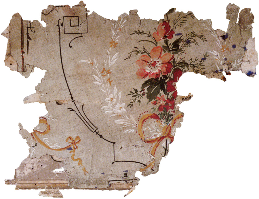
Amy Chan, wallpaper design (for assisted living facility), Spring 2018
Ornament and Design
May 2017
Ornament and Design II : Wallpaper and Emblematic Studies
pdf (1.3MB)
closing in (analytical prototype/prospectus exercise)
26 April 2017
user experience or other gap
problem definition
exploration of features that might address that problem
selection of features
design
prospectus
Coral Azevedo
currency / indigenous peoples
gap :
understanding of what it has taken, in terms of exploitation, colonialism, etc., to develop the economic system in which currency takes its meaning.
earlier forms of currency / promise of payment that were displaced, by that economic system.
currency, inspired by/depicting means of exchange for three indigenous groups in North America, Hawaiian islanders, Inuit, Navajo
risks :
ethnic etc stereotypes.
which groups included/excluded
need to present as suggestion only, or even work of political art, because of politics of whom to represent, and how
Kaleigh Brann
currency / women and labor
gap : poor awareness of women/money/labor issues?
what are those issues?
problem : need to define
women and work
value of dollar different, for different people (groups); dollar represents 20% more labor than it does to men
stay-at-home mother/parents (unpaid, unrecognized labor)
servants/domestics
National Shirtwaist fire
Rosy the Riveter
are these too specific?
[continue to think something about relative value of $1 is important to show, visually]
Morgan O’Connor
student studio space
gap
absence of place for students to work
(Morgan is one of those who use the tables recently provided in Hardie 2F central area)
student studio space
rationale : productivity
relationship to other spaces (living, library, studio/classroom)
formats
moveable walls?
what kinds of spaces, for what kinds of activity?
presentation : conceptual (variations)
specific (e.g., design, at Montserrat, in Hardie Building)
Jeremy Rodas
neighborhood zoning app
for neighborhood activists, to equalize their knowledge vis-à-vis real estate developers, urban planners, etc.
Air BnB
liquor stores
churches
population
ethnic, etc.
ease of use
GIS
Jade Ruscio
currency / trade (?) flows
gap :
problem definition :
flows (as in Edward Tufte)
of manufactured exports in a given year
better : flow, of trade or population, at three points in time
get data (where)
Courtney Ryan
"nomadic" space separator / identifier
gap :
imperfect dorm space, dysfunctional community (list factors)
space
nomadic
experimental (experimental living, communes, etc)
not for everyone (elective)
lightness
flexible
for dorms, but elsewhere too
other factors :
complementarity with other categories of space (at school: studio space, library/living room, studio and liberal arts classrooms)
privacy vs community
encourage a different, more mobile/nomadic, orientation to living space.
space / delimitation of space alone, as solution?
hints encouraging different attitude(s) to space?
what does one need? how much? when (does it vary from hour to hour, day to day?)
assumptions :
separate storage space
physical features :
fabric
hanging (requires fixtures in ceiling)
teepee, tents
easily set up, removed
references
Issey Miyake pleats please
nomadic living (tents, seasonal movement)
Japan: tatami living, put things away when not in use
Harrison Turner
currency / cash crops
gap / objective
reminder of basics underlying economic activity
cash crops: wheat, corn, marijuana, soybeans
aesthetics / treat purely as design (abstract ornament)
make these beautiful, a worthy competitor to credit cards, applepay, etc.
slow (rather than accelerate) spending
make transaction an interesting exchange
references
Frank Lloyd Wright his wheat (etc) wooden blocks; abstraction
Brosterman’s Inventing Kindergarten
analytical prototype 2 / banknotes
2 April 2017
Explore this area on the ninth banknote series, Swiss National Bank.
And explore the thinking behind the winning designs by Manuela Pfrunder, here. See in particular the theme of the series.
analytical prototype 1
2 April 2017
Develop a prospectus/analytical prototype of a design solution — or approaches — to a problem (or gap). The solution need not be a designed artifact, but may be a service, or set of procedures (that may involve some artifacts).
Some of us may choose to develop currency (paper money) ideas, as was done in Spring 2016. But the project is open to other realms as well; see the abstracts from Spring 2015. Y
our guide is to be the procedures outlined in the chapters of Ulrich that we have read. The final deliverable is a prospectus document, printed or web/adaptive (if printed, multiple pages, may be 8.5 x 11 inches), in which you discuss a perceived gap, definition of the problem, exploration of alternatives, and selection/development of a plan.
Final oral/visual presentations on Monday 8 May.
background reading
For some background ideas, read "Generation Anthropocene : How humans have altered the planet for ever"
by Robert Macfarlane. The Guardian. 1 April 2016
Whatever path you choose (currency, or other), I hope that this essay can inform you selection of gap/problem, and your approach to it. It is a powerful essay, with a lot of critical (and critically important) concepts and terms.
discussion
A common defect in design is a failure to understand the gap the user is experiencing. By deliberately defining the design problem, this defect can be avoided. An additional defect is a failure to pose the define challenge broadly enough to allow the exploration and discovery of a wide range of potential solutions. Those two poles — defining the design problem, and posing it broadly enough to allow exploration and discovery — are useful for us.
Karl T. Ulrich, Design : Creation of Artifacts in Society (2005-11)
Identify a gap or hole or shortcoming. Start with a gap in your experience. Define a problem or set of problems.
What kind of problems are there? Ulrich lists them: design problems; selection problems (choose from available alternatives); system improvement problems (modifications); tuning problems (incremental adjustments to parameters of existing artifact); crises (immediate); wicked problems (hard ones, for which even a clear definition is difficult).
We will focus on a design problem.
Start with a problem, not the thing you think you want to make/design — even if known to you (i.e., "paper" currency). What you want to make may be only one of many possible solutions, and not necessarily the appropriate one in some circumstances. Or maybe there are multiple solutions, a set of solutions.
Not everyone starts with a gap, in design. Sometimes one starts with an artifact, or a chemical, etc., a new technology, and looks for gaps that it might fulfill. Perhaps we have a new skill we want to try out. This is called technology push. Our focus on the "gap" needn't exclude the artifact/technology for which we want to find a use.
things, and more things
We tend to think of artifact, but perhaps the solution is not one more artifact. After all, the world is full of artifacts (that accumulate to become clutter, that get in our way, indeed are a visual reminder of our restlessness, that we seek to satisfy by acquisition, and that only increase that restlessness). Our solution may be intangible, a change in behavior. Yet there would need to be means by which behavior might be encouraged to change: another design challenge.
Problem hierarchies.
Levitt's line that >people buy 1/4 drill bits but need 1/4 inch holes. What they really need is to fasten a book shelf to a wall.
Desirable qualities in the artifact. Needs (list, Ulrich writes it might contain 300 to 100 desired qualities)
Stakeholders (for whom? multiple? same or conflicting needs?)
There are actual needs, needs the user can articulate, needs the designer can understand, needs that the designed artifact actually fulfills. Then gap between actual and fulfilled needs, andback to the process of iterative refinement.
Exploration
Remember Ulrich's array of roof pitches, layouts, etc., in his "shed world" discussion?
the prospectus
Our prospectus is the manifestation of our analytical prototype.
It will be developed from documentation of our exploration of gaps, problem definition, exploration of alternatives, selection of plans, refinements.
Think of it as the presentation you make to clients, funders, other members of a team, investors. It needs to look good, suggest thoroughness and seriousness, openness to conversation/change. It needs to be clear.
design a reflective conversation with the situation — Donald Schön
ornament and function : the wallpaper exercise
21 February 2017
Read —
Adolf Loos, his essays "Ornament and Crime" (1908/1929) and "The Poor Little Rich Man" (1900), and
Hal Foster his elaboration of Loos in his "Design and Crime" (2002), which originally appeared as "Hey, That's Me" — a review of Bruce Mau's Life Style (Phaidon, 2000), in the London Review of Books 23:7 (5 April 2001): 13-14).
And continue with Ulrich, Chapter 7 "Aesthetics and Design" in his Design : Creation of Artifacts in Society (2005-11).
the wallpaper exercise
As discussed last week, our first extended project involves the design of wallpaper / room treatment. The exercise includes the development of a prospectus outlining the situation to be addressed by the wallpaper; that document will naturally evolve over the course of the exercise.
Why wallpaper?
Wallpaper is an intersection point for several themes of concern to us —
1
Ornament — its relationship to beauty, appropriateness, and topical discussions of ornament in the nineteenth century, following the Great Exhibition of 1851, and leading to the major rejections of ornament by Adolf Loos, Le Corbusier, and others, early in the 20th century;
2
Wallpaper is an industrial product (becoming available to a new and rapidly growing middle class in the mid 19th century, thanks to large rotary steam presses, roll-fed paper, and other factors. As a designed industrial product, it lends itself to the kinds of method we have been exposed to in Ulrich's Design : Creation of Artifacts (2005-11).
Wallpaper design lends itself to new and traditional tools of design and production; some students have worked with dyes (indigo, for example); others have experimented with code (e.g., processing).
Specifications for this exercise have evolved over the years; we can proceed on the basis of instructions for 2015. We are as interested in purpose and problem definition, as we are in the aesthetic outcome.
Perusal of the archive of previous years' course blogs will be instructive. Much student work from previous years can be viewed via these links —
2015 (pdf; 1.2 MB)
2010
2009
216S07/wallpaper.htm
wallpaper_04/index.htm
readings, extracts
David Brett, On Decoration (1992) –
The desire for decoration, however, appears to be a cultural constant and is, historically, one of the defining characteristics of specific cultures.
Baldesar Castiglione, The Book of the Courtier (written between 1508 and 1528, when it was first published; Charles H. Singleton translation, 1959) –
...to practice in all things a certain sprezzatura [nonchalance], so as to conceal all art and make whatever is done or said appear to be without effort and almost without any thought about it. And I believe much grace comes of this...
Hal Foster, “Design and Crime” (2002)
originally appeared under title “Hey, that’s me,” a review of Bruce Mau’s Life Style (Phaidon, 2000), in the London Review of Books 23:7 (5 April 2001): 13-14
Isabelle Frank, introduction to her The Theory of Decorative Art : An Anthology of European & American Writings, 1750-1940 (Yale UP, 2000) : 5-10 –
The Crystal Palace exhibition helped transform decorative art from a domain of relatively limited interest into one of public consequence, exposing for all to see the relative merits and weaknesses of national products.
David Gelernter, Machine Beauty : Elegance and the heart of technology (1998) : 22 –
Beauty is the ultimate defense against complexity. Beauty is our most reliable guide...
Lesley Hoskins, The Papered Wall : History, Pattern, Technique (1994, 2005) –
Ever since wallpaper first became widely available its status has been questioned: is it background or foreground, art or decoration, vulgar or respectable, a substitute or the real thing?
Adolf Loos, “Ornament and Crime” (1908/1929), in Adolf Loos, Ornament and Crime : Selected Essays (1998). –
The urge to decorate one’s face and anything else within reach is the origin of the fine arts. It is the childish babble of painting.... A person of our times who gives way to the urge to daub the walls with erotic symbols is a criminal or a degenerate.... the evolution of culture is synonymous with the removal of ornamentation from objects of everyday use.
Alice Twemlow. “The Decriminalization of ornament. Spurned and marginalised for a century, decoration is enjoying a guilt-free renaissance.” Eye 58 (Winter 2005) : 18-29
“Ornament,” from Ralph Nicholson Wornum’s “The Exhibition as a Lesson in Taste,” published with other essays at the end of The Great Exhibition : The Art Journal Illustrated Catalogue : The Industry of All Nations (1851) : pp xxi-xxii, from Section ix.
update
6 February 2017
discussion of Ulrich Chapter 2, "Problem Solving and Design," and draft emblems
last week —
Gui Bonsieppe. "Visual-Verbal Rhetoric" in his Interface : An Approach to Design (1999) : 69-82
Aristotle, Art of Rhetoric (J. H. Freese translation, 1967) : marked passages in pages 13-41
Plato, the passage entitled "Rhetoric, Actual and Ideal," from The Phaedrus (266d-274)
the passage in Castiglione's The Courtier (1528), on the art that hides its art, but the dangers thereof.
Robin Kinross, on the “modern”, in Fellow Readers (1994) — "...an immaculate surface that leaves no room for dialogue..."
Wednesday, we considered the Renaissance (and later) emblem form (Alciati to the present), and the idea of the ABC structure (motto, allegorical image, secondary/explanatory text). We also looked for triadic forms in magazine ads, and found them everywhere.
a quick exercise —
develop three emblems, one (textual) element of which should incorporate a phrase from our reading on and around rhetoric, and design. no size limit. ideally, the emblems will, in their unique configurations of elements, lead to or encourage new knowledge and/or ideas.
welcome
18 January 2017
The constructed space is open in all directions.
Architecture begins before architecture.
Heinz Tesar (1939- , *), Notate
Overall shape of the class, and introduction to the first readings —
- Vilém Flusser's essay "On the word design," in his The Shape of Things : A Philosophy of Design (1999)
- the OED definitions of the word "design" (noun)
- the first (introductory) chapter of Karl T. Ulrich's Design : Creation of Artifacts in Society (2011).
- Norman Potter, "Is the Designer an Artist?" (1969) in Alex Coles, ed., Design (Documents of Contemporary Art, 2007): 29-33
Our first exercise will be to select a designed object, research it — its intended purpose, its function (what it does), dimensions, material qualities, and perhaps precursors, patents, designer, uses, misuses, where found, its current condition (and what that might suggest about its use, value), etc., etc. — and then develop a way to present this information. In recent years, we have used The Phaidon Archive of Graphic Design as our model; this time, the design will be up to you. We will look at some examples (Jenny Odell her Bureau of Suspended Objects, Phaidon Archive), but these are not intended to limit you.
Bring in the item, and what you've learned about it and its being situated in the world, on Monday 23 January.
Also, write — and bring in (or post to this blog) — a one-page response to at least one of the readings.
We may use the third floor walls for this first exercise (16 January through 7 February), or the second floor walls (for this or other work) during the period 8-21 February.
Clearing the Haze: Prologue to Postmodern Graphic Design Education through Sheila de Bretteville
26 April 2016
this is very good.
Izzy Berenson and Sarah Honeth. Clearing the Haze: Prologue to Postmodern Graphic Design Education through Sheila de Bretteville
The Gradient / Walker Art Center, April 26, 2016
Author’s preface: At the outset, this project was defined as an intensive effort to examine and reassess the work of Shelia Levrant de Bretteville. The initial motivation was driven by the connection of the rise of feminist voices in design, the Woman’s Building, postmodern design, and experimental pedagogy. We recognize that many female designers worked in the 1970s and 80s, however we saw that few had as large a contribution on contemporary graphic design today, as Sheila Levrant de Bretteville.
and this, which relates to our earlier "designed object" exercise —
This multi-disciplinary class included an aspect of what has become known as “the object project,” and the beginning of her faith in the meaning of every choice in physical and visual form making. “The object project” asked each participant to bring in an object. As students went around the room and each person described the physical aspects to the object chosen, Sheila was astonished to see how much information was inadvertently being revealed about the person as the student described their chosen object. New to teaching, Sheila was unsure how best to deal with what was embedded in the physical form of the objects, which was much more than she had ever anticipated. She knew that each of us is intimately connected to the things that we choose, but it took a fair amount of time for her to recognize that she could use this intuitive attraction to objects, events, and situations to develop the intimate connection to the physical qualities of the work that students produce.
new faces on UK currency
25 April 2016
The Living Mountain author Nan Shepherd to feature on Scottish bank note Writer Robert Macfarlane hails the Quarry Wood novelist, who will adorn £5 notes entering circulation later this year, as ‘a brilliant, progressive choice’ Alison Flood. The Guardian, 25 April 2016
New £20 note design and personality unveiled by Bank of England Kevin Peachey. BBC News, 22 April 2016 (thanks Katie Dygon)
JMW Turner to be face of next £20 note Painter to become first artist to appear on a British banknote after public is asked to nominate deceased cultural figures Hannah Ellis-Petersen. The Guardian, 22 April 2016
but see
Why putting women on banknotes should make us feel uneasy Those at the sharp end of inequality might be forgiven for failing to see how a caricature on money they don’t have will help Eve Livingston. The Guardian, 26 April 2016
and more!
New Zealand's 'stunning' $5 note named best banknote of the year
Design featuring Sir Edmund Hillary judged ‘clear winner’ against Sweden’s 20 kronor note, Russia’s 100 ruble and Kazahstan’s 20,000 tenge
Elle Hunt. The Guardian. 26 April 2016
currency design / proposals
20 April 2016
- regarding the "United States," see
"A New Map for America" / Rethinking the Map How the lower 48 could be realigned into seven mega-regions. Parag Khanna. The New York Times (SundayReview), April 15-17, 2016
"What would this approach look like in America? It would start by focusing not on state lines but on existing lines of infrastructure, supply chains and telecommunications, routes that stay remarkably true to the borders of the emergent super-regions, and are most robust within the new urban archipelagos."
see also ayjay's (improved) version
- topics (my own) :
randomly selected habitats
randomly selected bacteria, or anything else on the expanded "Tree of Life"Scientists Unveil New ‘Tree of Life’ Carl Zimmer. NYTimes Science, April 11-12, 2016
The Tree of Life Just Got a Lot Weirder Ed Yong. The Atlantic. April 2016
"Using techniques that can extract DNA from environmental samples—scoops of mud or swabs of saliva—scientists have been able to piece together the full genomes of organisms whose existence is otherwise a mystery..."
Ed Yong is excellent science writer/blogger/tweeter. @edyong209
sprezzatura, again
13 April 2016
Stumbled onto this — Should Beauty Be Effortless — at Auxiliary Beauty, posted February 28, 2015.
It's a rumination on "effortless" versus "Instagram" beauty. and Castiglione's sprezzatura plays a part.
Good skincare is far pricier than good makeup, and it's cheaper to change your look with a new lipstick than with a new outfit.
currency design / proposals
12 April 2016
paper, no size restrictions.
both sides.
three values (e.g., $1, $5, $10; $10, $50, $100).
United States.
avoid straight "tonal" photographs: consider other means of image rendering, e.g., lines.
and of course, abstraction.
subject/theme should not be a person, nor should the theme relate to "identity."
if monuments, avoid the obvious.
our background reading — Generation Anthropocene (the survey of work on state of precarity), Arts of Noticing (the matsutake mushroom book) — was intended to provide a general framework to the project. the thinking behind Manuela Pfrunder's redesign of Swiss currency suggests the thoroughness and sophistication to which the thinking might — and for currency, surely ought to — go.
may treat exercise as conceptual art.
presentations on last day of semester (Monday 2 May).
these are to be accompanied by a document/prospectus, something like the wallpaper/treatment prospectus.
initial ideas/directions (as presented on Monday 11 April) ‐
Alexandra / (purely typographic)
Adela / (vertical re-orientation; blueprints/lines)
Gabrielle / landmarks (currency employing tracker device; smaller size)
Stephanie / sea, current, flowing, depths (discussed macroeconomics as a giant plumbing operation)
Li Yun / (symbolic) plants
Lauren / nature (discussion: what is "nature"?)
Katie / geographic region (regional flower, etc.)
Britney / humor and serious (e.g., Black Lives Matter). $1=bag of chips. (talked about price of a slave, etc.)
Devon / topographic maps / urban vs nonurban (discussed other similar e.g., bathymetric, heat in oceans, meteorological)
Elise / colors (natural), geometry, layers (discussion about meaning of symmetry for U.S. currency)
references —
new swiss banknotes, designed by Manuela Pfrunder www.manuelapfrunder.com
Here is where some digging into history will make sense: what has currency looked like, over time and space? How are images formatted (halftones? but what else?)? What might currency look like in future? How will we use it? Who is "we"? Who will use it?
Is the currency itself, a bank of value? Who needs that bank the most?
life (and design) in the anthropocene
6 April 2016
for Wednesday 6 April, read
Generation Anthropocene : How humans have altered the planet for ever
Robert Macfarlane. The Guardian. 1 April 2016
and for Monday 11 April, read
Chapter 1, "Arts of Noticing," (pages 17-25) in
Anna Lowenhaupt Tsing, her The Mushroom at the End of the World : On the Possibility of Life in Capitalist Ruins (2015).
Tsing discusses different kinds (and paces) of worldmaking, progress (linear) versus assemblages.
This "anthropo-" blocks attention to patchy landscapes and multiple temporalities, and shifting assemblages of humans and nonhumans: the very stuff of collaborative survival. (p20)
where (I think) we're headed —
new swiss banknotes, designed by Manuela Pfrunder
www.manuelapfrunder.com
via RT by @schuelithaber, here.
our banknote theme will be drawn from the "anthropocene" and "matsutake mushroom" readings.
Universal Principles of Design / topics
1 April 2016
for presentations on Monday, these topics, by these students —
Anthropomorphic Form / Lauren Cox
Baby-Face Bias / Stephanie Cambria
Cognitive Dissonance / Katie Dygon
Color / Li Yun Chen
Expectation Effect / Britney Payton
Interference Effects / Devon Unwin
Mnemonic Device / Alexandra Bonin
Ockham's Razor / Adela Bukva
Operant (and Classical) Conditioning / Gabrielle Burgess
Wabi-Sabi / Elise Walsh
These presentations will be oral. You may wish to use visuals, either printed or perhaps online (including something you may have posted on this blog).
Something we noticed, during out discussion of these topics, was that the book (published in 2003, updated in 2010) is showing its age. Some of these instances had to do with representation, e.g., of women, or of accident victims ("classical conditioning"). The idea that there are things, concepts, that a designer needs to know — as if they are established, beyond question — is itself open to question, open to open-ing.
prospectus
1 April 2016
We can think of Kickstarter as a kind of prospectus. Ordinarily, the proposals there have already been developed beyond the initial (1) perceive gap, (2) explore and define a problem, (3) explore alternatives, (4) select for design.
But the idea of the prospectus is not obscure. Here are some examples that have interested me.
- Ergo Kiwi: A Better Craft Knife for Designers and Makers
- I wonder what it's like to be dyslexic, 2
- Bibliotheca
- The Bradley Timepiece a watch for blind people
Your prospectus needs to provide some context to potential partners, customers, investors; demonstrate by thorough preparation why they should trust you, work with you.
On Wednesday 16 March, we will meet — together with Senior Fine Art Seminar — at 248 Cabot Street, Room 208 at 12:30pm, where Jenny Odell will discuss her work as a... well, here's her self-description —
I am a Bay Area native/captive. My work combines the mining of online imagery with writing and research, usually in an attempt to highlight the material nature of our modern networked existence. Because my practice involves collecting, tagging and cataloguing, I have often been compared to a natural scientist – specifically, a lepidopterist.
jennyodell.com
After that meeting lasting about an hour, we'll repair back to Hardie to work on our proposals/prospectuses, and perhaps to print some tests.
wallpaper / room treatment
23 February 2016
Monday 29 — presentation of visual ideas, and situations they are intended for. we are aiming for selection of ideas for "plan" by Wednesday, latest. Final format will be: prospectus of the designs, and their background. prototypes (at full scale) of ideas. conclusion Wednesday 16 March. The prototype can be in a form of your choosing, but should frame your wallpaper/room treatment in ways that align with Ulrich's method: identify gap in "user" experience; explore and define a problem; explore alternatives (his "shed world"), select a plan, and develop the design(s). One can imagine that a prospectus might present one wallpaper in several motifs and/or color combinations. Eventually, I will develop a single booklet that presents one (or more?) designs, plus the (possibly edited) gists of your prospectus documents. The prospectus is the nicely designed document you would provide to a client, potential partner, etc., that contextualizes the design solution you are offering. It can also encourage further interaction with partners/clients/others, to help identify needs. Alice Twemlow's essay "The Decriminalisation of Ornament" (in Eye Magazine no 58, Winter 2005) came up. Here's a link to the text. — Monday 22 — following a discussion of the Loos and Hal Foster readings, we proceeded to the wallpaper / room treatment ideas. The ideas start with a situation — a room or space, used by whom, for what. And what effect/function we are interested in.
- Alexandra / dorm room. current problem: strange institutional colors. challenge: wallpaper for art school students. ideas floated: blackboard...
- Stephanie / mural, kind of a moodboard... challenge: leave room for new drawings, ideas.
- Li Yun / living room. animals, (gold) fish. discussion: schools of fish?
- Lauren / geometric forms (triangles?), accent wall...
- Katie / sun room (solarium), using watercolors, on interior wall
- Britney / kitchen. fruit or animals. ingredients used by her mother in spaghetti sauce...
- Devon / safe space, 3D models of (an extension of a school project done years ago). mentioned this work by Sean Coderia
- Elise / treatment of stair "risers", possibly involving wall as well. we discussed transition, visible only when ascending not descending stairs. the opportunities afforded by the "transitional" space of stairs. referenced Christopher Alexander his A Pattern Language (1977), its passage on stairs. Gaston Bachelard discusses stairs in his The Poetics of Space (1958, translation 1969), pp 25-26 (and elsewhere?); in library at B 2430 B253 P6313 2014.
- Gabrielle / petals, leaf motif. for a woman in 30s-40s, owns own home.
- Adela / typographic. cyrillic and western alphabet. fragmented/reordered/recombinant. potentially for a design studio wall.
beauty, ornament and design
17 February 2016
For Monday 22 February, read Adolf Loos, his essay "Ornament and Crime" (1908/1929) and Adolf Loos, "The Poor Little Rich Man" (1900), from Spoken into the Void: Collected Essays 1897-1900.
These are discussed in Hal Foster, "Design and Crime" (2002), which originally appeared as a review of Bruce Mau's Life Style (Phaidon, 2000), in the London Review of Books 23:7 (5 April 2001): 13-14).
We are segueing from considerations of sprezzatura, ethos/logos/pathos, and Ulrich's consideration of the role of aesthetics in design, to the function of beauty and ornament (excess, in honor of) in design.
Our project will involve wallpaper, or some other means of decorating, demarcating, identifying or providing some means by which one can have some kind of relationship with a space. But we will use something like Ulrich's method, or identifying a gap, exploring and defining a problem, and then proceeding with selection/planning/design. The solution may or may not be wallpaper.
post V-Day
17 February 2016
For Wednesday 17 February, read Ulrich chapters 4 (Exploration) and 7 (Aesthetics in Design).
Exploration
Ulrich's key question about exploration is this —
Has the scope for exploration been defined in a way that the space of possibilities includes high-quality solutions?
Representation and Abstraction (what we do on screen, if it is destined for print, is a symbolic representation. Ditto if we are coding: again, symbolic representations, for presentation by browser or other device.
Representation requires abstraction. (some details are left out.) Representations reduce complexity, but also allow representations to be stored as external memory.
Representations in exploration are informal ("neither the syntax nor the semantics are defined precisely").
key example, Shed world — 4 heights x 5 aspect ratios x 4 roof types x 2 roof orientations x 4 roof pitches yields 640 distinct sheds.
Exploration strategies —
- hierarchical : fixing variables, working sequentially from there
- parallel exploration and selection : but only so far as necessary to assess likely quality of that particular trajectory/outcome
- causal relationships : e.g., height constraints on shed, because of transportation
- existing artifacts : analysis of these, even use of templates
The Shed world example leaves out details — possibly important details, e.g., paint, weathered shingles, location of windows. And it "constrains exploration to the boundaries of the grammar," thereby creating what I would call myopic busywork, whilst foregoing other avenues. Ulrich suggests that exploration of alternative representations (different sets of constraints and abstractions) is the way around this problem.
Ulrich concludes the chapter by wondering if design, or some parts of design, can be automated.
Aesthetics in Design
Aesthetic response is immediate, involuntary, and an aggregate assessment. It is not nuanced.
evolutionary aesthetics — Vestigial adaptations contribute to first impressions.
a comfort, facility with, a being conversant with, sophisticated new technologies, presumably puts one at a competitive advantage.
Ulrich states that "aesthetic features are honest signals of quality," because it is too costly to fake.
Artifacts have symbolic value in social systems — this is self evident.
Just before his concluding remarks, Ulrich writes (and this relates to the exploration process discussed in chapter 4), that "Better solutions are likely to be found in territory distant from the starting point."
While no theory of convincing theory aesthetics in design is available now, we can think of the aesthetics in rhetorical terms, having to do with ethos — the emotional connection of speaker/designer/object to audience/consumer/user.
reading response
One page, on either of the chapters (on methodical exploration — its hows, its strengths and limitations — or aesthetics in design. Relate these to your own experience in design (even in class projects), or more generally to earlier reading/thinking.
Also, be thinking about a gap, something you would like to explore, with a mind to finding some problems that might be refined, defined, and even addressed.
tweaks and reading
3 February 2016
for Monday 8 February, final tweaks if required to "designed object" exercise.
When we identify a "thing" to talk about, what are we doing? What rises to the occasion of being a "thing"? What is or might be relevant? Where (and when) does a thing begin and end? (think in terms of life cycle, materials, users, reuses, multiple uses, etc.)
read
Ulrich chapters 2 "Problem Solving and Design" and 3, "Design Problem Definition" and
introduction (pages 7-10) to Richard Hollis, Graphic Design : A Concise History (2002).
Consider whether and even how Ulrich's discussion of defining a design problem relates to rhetoric, e.g., its invention/discovery phase.
Write a one-page response to either the readings, or the question of what constitutes a designed object. What is relevant? Where does the object begin and end?
If you have not done the earlier two reading responses, do them now.
They were:
2 Gui Bonsieppe. “Visual-Verbal Rhetoric” in his Interface : An Approach to Design (1999) : 69-82
Aristotle, Art of Rhetoric (J. H. Freese translation, 1967) : marked passages in pages 13-41
Plato, the passage entitled “Rhetoric, Actual and Ideal,” from The Phaedrus (266d-274)
and
1 Vilém Flusser’s essay “On the word design,” in his The Shape of Things : A Philosophy of Design (1999)
the OED definitions of the word “design” (noun)
the first (introductory) chapter of Karl T. Ulrich’s Design : Creation of Artifacts in Society (2011).
Tara Parker Pope, “Develop a Whole New You” (on the application of Design Thinking to life), The New York Times (January 5, 2016) : D4 (and online as “Design Thinking for a Better You”)
design and rhetoric, 4 (an aside)
2 February 2016
In our discussion of delivery and sprezzatura yesterday, I mentioned and showed excerpts of Olga Kern's performance of Rachmaninoff's Piano Concerto No. 3 in D minor (Op. 30).
My reason for bringing it in, was she sheer difficulty of the piece, and the difficulty of playing it, possibly not hidden by Kern. Among the many comments to that performance, were these three, that interested me —
David Franklin
Bravo! What a great performance. Unlike some performers who breeze through this thing like butter, you can see that she finds it very difficult to play, and a genuine strain — which it should be. Her red face, and shifting about on the seat, shows how difficult she finds it. But despite all that she struggles through with a heartfelt performance and the audience rightly jump to their feet at the end. This is much better than many performances simply because it's so genuine. Lovely.
mafnpafn mafnpafnster1
David Franklin you maybe see it as struggle while I experience she goes through keys of emotions, e- motions as energy in motion.. anyway, breathgiving
Tim Spriggs
David Franklin It is the make or break piece of the Van Cliburn. The gold standard.
The emphasis is my own. There is an honesty and even rhetorical virtue, in being natural in performance of so astonishingly difficult a piece. The thought arises, here, that the virtuosity that is the subject of our passages in Castiglione, have something like their apotheosis today, where competitive pressures, international markets/money, and media together exert enormous pressure to perform at the highest levels (and hence are accompanied by performance-enhancing drugs and other scandals in the sports world). We see ambivalence about Kern's performance in Franklin's bravo, and mafnpafn's response.
virtuosity
One might generally think of virtuosity as applying to individuals — great draftsmen/women, violinists, tightrope walkers, etc. It is generally associated with craft and even performance, where skill not avant garde concept is at stake. (Can there be a virtuoso philosopher? Would it be Wittgenstein?)
And, can we think of a virtuoso entity, enterprise, corporation? Apple? Google? an entity seemingly so good (and virtuous) at what it does, that we're mesmerized? uncritical?
Can a product — an object — embody that virtuosity, as if bottling it for future consumption, as a kind of "holy water"?
design and rhetoric, 3
1 February 2016
Should have talked earlier about the five traditional parts of rhetorical theory, which have to do with
- invention / discovery
Investigation of the facts of the case, and the kinds of arguments that might be appropriate in the present circumstances. Discovery — a term that is used in the contemporary courtroom — is related to this.
there might also be set "topics" of invention (topoi), which are something like off-the-shelf arguments, situations. - arrangement
ordering of the material, e.g., introduction, narration of facts, summary of the argument; proof, etc. For Design, this might also have to do with visual structure. - style
choice of words (or image, or typeface, etc.). - memory
very important for a speaker without notes
and - delivery
Related to style, might involve even posture, hand gestures, music/sound track?
These make some sense in terms of design, and even correlate with some (not all) of Ulrich's steps in the design process.
See pages 36-42 in Richard Toye, Rhetoric: A Very Short Introduction (2013)
Sprezzatura
the passage in Castiglione's The Courtier (1528), on the art that hides its art, but the dangers thereof.
...an immaculate surface that leaves no room for dialogue...
— Robin Kinross, on the “modern”, in Fellow Readers (1994)
account of designed objects
work in class, one-on-ones. presentations on Wednesday.
Personal Item Progress
Adela, 27 January 2016
Originally, I was going to work with a self-sewing pattern design from a local, vintage company. I wanted to index the clothing that was made for me as a child as well as the relationship between me and the women who made my clothes, however, after realizing how difficult it would be to contact relatives over seas and dig up childhood garments, I decided that the personal connection to this particular item would fall short. I've now decided to work with a different item, one who's company history is both accessible and up to date: the Fujifilm Instax Mini 8 camera, a present I received for my 21st birthday. Since then, I've used this camera to capture holidays with family, quiet moments with loved ones, and weekend adventures with my good friends. This item allows me to go more in depth with my personal attribution to this project.
Fujifilm is a Japanese company that focuses on innovation in fields of consumer products and business products, however, they are most known for their film and camera products. The Instax Mini 8 is a relatively new product; it became available to the public in late 2012. After its release, it became widely popular in not only Japan, but in the United States as well.
But why is this particular company so personal to me? Since I can remember, my family has always used Fujifilm for our film and camera needs. Now that I have an instant camera product of my own, I've taken full advantage of its purpose. Ideally, I'd like to design some sort of book that reflects on the product's origin of design, its purpose, as well as my own visual history with the Instax Mini 8.
design and rhetoric, 2
27 January 2016
Read and consider the concluding passage of Plato's Phaedrus, involving "the inferiority of the written to the spoken word," and consider how this might relate to design.
Review the OED definitions/historical usages of the word experiment, in its noun, adjectival and verb forms.
Write a one-page response, ideally adding a thought or interpretation, rather than simply reiterating.
We talked about the senses and uses of experiment on Monday (experimental philosophy, experimental preaching, experimental religion; perhaps experimental writing?). We will pick that up again today.
You can't learn physics or other sciences without doing experiments. The same holds for graphic design.
— Malcolm Grear, Inside | Outside : From the basics to the practice of graphic design, Second Edition (2006) : 26
aside
Rhetoric begins with a situation. the situation involves people — the rhetor (designer, speaker); the thing (the poem itself, the vehicle for the message or the rumination); the listeners/viewers.
So it starts outside of the “thing,” before the thing, after the thing, but beyond the thing.
involves the people.
There’s a teleology, at least in Plato’s (Socrates’s) conception in the Phaedrus — we speak to please the gods. We are in service of what the gods want.
We do not speak to please a person, or only do so to please the gods, who expect virtue.
The emphasis on ethos (which is character born of habit, not intention), relates to vertú and even to sprezzatura — the art that hides its art, that makes hard things look easy, natural — which we will be considering in Baldesar Castiglione his The Book of the Courtier (published in Venice, 1528), and as it relates to design practice, and designed objects.
Ethos — the rhetor's, the speaker's, the designer's character — can also be thought of as a kind of authority. This authority can be earned by competence, perceived quality, style, fame, the kinds of clients someone works for, and budgets. It can derive from other sources too, including what a designer chooses not to work on. It is an asset and even a form of moral capital. A designer can borrow authority from her/his school, or clients, for example; and a designer can lend her/his authority to a cause, a message, a "design." In fact, both can happen.
Paul Rand can be thought of as an exemplar of this economy of authority.
designed object project
I am considering either (1) specifying a format, or (2) asking that you "surprise" us, but that you do so by next Wednesday, or (3) either (you choose). We will discuss this today (27 January).
If specified format, use that of The Phaidon Archive of Graphic Design —
(to be cropped from 11x17 sheet)
width : 240mm
height : 315mm
top margin : 15mm
bottom margin : 15mm
left and right margins : 18mm
center margin : 4mm
Note different thicknesses of top and other horizontal rules.
Top info row is 15mm high
Two bottom rows seem to be flexible, depending on length of text.
Typeface : Helvetica (you'll need to compare output against original, to determine actual type sizes, as well as thickness of rules)
design and rhetoric
25 January 2016
Reading and discussion of rhetoric and design, in light of
- Gui Bonsieppe. "Visual-Verbal Rhetoric" in his Interface : An Approach to Design (1999) : 69-82
gives some visual examples.
we talked about a couple of terms in class: parataxis (things put side by side, without syntax), versus hypotaxis (one thing above another, which suggests hierarchy, subordination) - Aristotle, Art of Rhetoric (J. H. Freese translation, 1967) : marked passages in pages 13-41
its function is not so much to persuade, but to find out in each case the existing means of persuasion... (13); the faculty of discovering the possible means of persuasion in reference to any subject whatever... (15)
three kinds of proofs: "The first depends upon the moral character of the speaker, the second upon putting the hearer into a certain frame of mind, the third upon the speech itself, in so far as it proves or seems to prove." (17
moral character (ethos) the most effective means (17)
rhetoric cannot be the subject of a true science (23)... its function is "to deal with things about which we deliberate, but for which have no systematic rules..." (23)
three kinds of rhetoric — deliberative, forensic, and epideictic (display) (33);
"But in proportion as anyone endeavours to make of Dialectic or Rhetoric, not what they are, faculties, but sciences, to that extent he will, without knowing it, destroy their real nature, in thus altering their character, by crossing over into the domain of sciences, whose subjects are certain definite things, not merely words." (41) - Plato, the passage entitled "Rhetoric, Actual and Ideal," from The Phaedrus (266d-274)
passage begins with rather technical discussion, which ultimately concludes with the suggestion that technique alone is insufficient. rhetoric is compared to medicine. wherein is the "science" of rhetoric? close knowledge of "the nature of the thing to which he is to apply his rhetoric. And this means the mind..." (p79)... but continues on from there.
Perhaps knowledge need not be copied, templated, or distributed in a common form. Perhaps idiosyncrasy and specificity are resources as well. Triptychs, expanded cinema, and installations may not easily port to the web but like playing a violin at Carnegie Hall or in a Gothic cathedral or a subway tunnel, they may serve as demonstrations that engaging with the specificities of local infrastructures is a difference that makes a difference. There are performative dimensions to knowledge transmission and material specificities in the relationships between form and content.I will expand on this in our discussion of these passages, with regard to the idea of experimental preaching, and what that term experimental (having to do with testing) might involve for us. accounts of designed objects
- Phil Aguirre / gold marker
- Alexandra Bonin / chromolithographic postcard
with writing and angled stamp (see The Edwardian Social Network, via cooeee) - Adela Bukva /
dress patternFujifilm Instax Mini 8 camera - Gabrielle Burgess / strum stick
history (Bob McNally) - Stephanie Cambria / Melatonin sleep supplement
wikipedia. may be interested in packaging, and how it is marketed - Li Yun Chen / Haba (brand) soap in shape of Monkey
this is the Year of the Monkey - Lauren Cox / Doral brand cigarette, wood match tin
sepia-toned nostalgia theme
Tobaccoville, North Carolina - Katie Dygon / carousel music box
- Britney Payton / Japanese fan
small, perhaps for shoyu? about 2.5 inches diameter, 3/4 inches deep, with a blue pattern decoration; no marks underneath (probably came in set) - Devon Unwin / Pen-Tab tracing paper TR59
used by grandmother, for preparation of a painting - Elise Walsh / cameras owned by grandfather
Brownie box camera, and a Voigtländer camera
see thumbnails (linking to further info) of all Voigtländer cameras
welcome
13 January 2016
The constructed space is open in all directions. Architecture begins before architecture. Heinz Tesar (1939- , *), Notate Our first day, the instructor will discuss the overall shape of the class, and introduce the first readings —
- Vilém Flusser's essay "On the word design," in his The Shape of Things : A Philosophy of Design (1999)
- the OED definitions of the word "design" (noun)
- the first (introductory) chapter of Karl T. Ulrich's Design : Creation of Artifacts in Society (2011).
- Tara Parker Pope, "Develop a Whole New You" (on the application of Design Thinking to life), The New York Times (January 5, 2016) : D4 (and online as "Design Thinking for a Better You")
analytical prototypes / prospectuses
4 May 2015
Meg Bentsen
Transfer Program Proposal
- gap / problem definition : transfer students (important to the college community) are not getting sufficient or timely advising with regard to credits that can be tranferred in (and in fulfillment of what); orientation program is focused on new (not transfer) students and their situations; transfer students are typically more mature, but find it hard to connect to continuing students in dorms etc.; initial isolation from academic advisors
- exploration : more timely information; clarity about being able to skip some required Foundation courses; meetings with academic advisors during orientation week; importance of declaring concentration, and being provided an appropriate advisor)
Ziyi Feng
driving aids for international visitors
Mariah Florez
Healthy Artist Initiative
- gap : students in dorms have access to kitchens, but their hectic work-class-homework schedules mean that they default to bad eating options
- exploration : machines, etc. student-run kitchen focussed on healthy options
James Hillmann
Autorun
- problem definition : PC gamers need to get the most play time out of their game, owing to subscription model, leading to lack of activity, nutrition and sleep.
- exploration : cut out video games (unrealistic); exploration of game addiction; alternatives to generating gaming
points
outside the game - select and develop plan : Autorun marketplace when user activity (steps walked counted by motion sensor and even heart-rate monitor) generate game points
- further development :
active points
are to be redeemed in rewards in app, generating ad impressions which pay for rewards
exercise suggested applications for other genres
Alec Iverson
making downtown Beverly safer for pedestrians and cyclists
- problem definition : high speed traffic, particularly at rush hour(s); confused street directionality
- exploration of options : (removable and permanent) speed bumps; traffic lights (at Cabot/Knowlton); more yield and pedestrian signage; overall
restructuring
of Cabot Street (removal of parking on one side, introduction of designated bikelane); curb extensions on Cabot; creation of new parking structure (to compensate for reduced parking on Cabot, and to make monitoring more efficient); funding options
Angel Lukos-Algarin
Educating about nuclear energy
seeks to balance negative attitudes about nuclear, with positives (e.g., potential; engineering solutions to waste; small modular (nuclear) reactors
Jessica Hegenberger
Pembroke, Massachusetts / A health, safety and fun proposal
- problem definition : few sidewalks outside the center of town, making walking and bicycling a dangerous undertaking
- exploration : new sidewalks (unfeasible); introduce shuttle service in summer months, to bring people to events in center of town
- select and develop plan : would need to develop interesting events, and also to advertise these
Juan Matias
Solutions for Patient Illiteracy in Haiti
- gap / problem definition : patients are challenged to navigate their way through hospitals and clinics, because they are illiterate (and afraid to admit it, for fear of being taken advantage of, or out of embarrassment)
- exploration: signage employing icons; color-keyed directional signs; provision of concierge-like nurse and voluntary assistants, to guide patients through facilities
Cody Pelletier
Samantha Perry
More Problems than Solutions? How to give veterans better health care- gap : imperfect provision of veterans care
- exploration : connecton of veterans care to overall health care initiatives; Democratic and Republican arguments; other countries
- develop plans : move from
veterans
to whole country (or, expand what veterans have access to, to entire country); depoliticize health care debate; increase awareness of what other countries offer
Alexandra Rios
Art Supply Source- gap identification, problem definition : no easy access to art supplies
- exploration : history; other schools; alternatives (storefront, website, vending machine)
- select and develop plan : vending machine
Shelby Rivers
- problem : phone usage while driving
- solution : car mode
Chase Terranova
The Student Debt Problem- gap : student understanding of what they are getting themselves into
- exploration : surveys, one for current students, another for alumni/ae.
- analysis of survey results, development of design plans : more education about how loans work. lower interest rates.
Jack Truong
improvements to buying online
in terms of sampling goods; returns, etc.Kayla Whelan
Montserrat College of Art website solutions- gap / problems : conservative aesthetics; not mobile-friendly; confused navigation; absence of sitemap
exploration : options are to (1) reorganize; (2) keep existing organization, redesign; <3> total overhaul - research (other schools)
- plan selection and exploration : new site map, new home page designs
wallpaper / ornament catalogue
4 May 2015pdf (1.2MB)
presentations, last day
4 May 20155-10 minutes each.
John Colan will join us at 9:00am.state the gap / problem.
your investigation of that problem.
analysis, definition of the problem.what parts of the problem a solution might address.
exploration (of solutions).
options.
selection of one plan from several,
elaboration of that plan, and how it addresses the problem.you may use the large monitor if you wish. have files ready for display, on your (or my) laptop.
the analytical prototype/prospectus documents are due on this day, as well.bottom line(s)
we are using the Ulrich's somewhat methodical approach to design, as a way of getting everyone to start not with a thing we want to make, but with a problem to investigate.the experience is the important part, and learning is the "deliverable."
analytical prototype / prospectus, further
15 April 2015It may be that the most important aspect of our problem definition work, is to unpack its circumstances — see its constituent parts but also the web of issues beyond that, in which it is embedded.
While this may seem to take us far afield from what we thought we were interested in, it will provide insights, and help us not only define our problem, but frame it for ourselves and — equally important — others.
We can then bring back the insights gained, to our more narrowly focused project.
analytical prototype / prospectus
1 April 2015A common defect in design is a failure to understand the gap the user is experiencing. By deliberately defining the design problem, this defect can be avoided. An additional defect is a failure to pose the define challenge broadly enough to allow the exploration and discovery of a wide range of potential solutions. Those two poles — defining the design problem, and posing it broadly enough to allow exploration and discovery — are useful for us.
Karl T. Ulrich, Design : Creation of Artifacts in Society (2005-11)in brief
Develop a prospectus/analytical prototype of a design solution to a problem. The solution need not be a designed artifact, but may be a service, or set of procedures (that may involve some artifacts).
Your guide is to be the procedures outlined in the chapters of Ulrich that we have read. The final deliverable is a prospectus document, multiple pages, 8.5 x 11 inches, that in which you discuss a perceived gap, definition of the problem, exploration of alternatives, and selection/development of a plan.
This exercise is an experiment. Final oral/visual presentations on Monday 4 May.
discussion
Identify a gap or hole or shortcoming. Start with a gap in your experience. Define a problem or set of problems.
What kind of problems are there? Ulrich lists them: design problems; selection problems (choose from available alternatives); system improvement problems (modifications); tuning problems (incremental adjustments to parameters of existing artifact); crises (immediate); wicked problems (hard ones, for which even a clear definition is difficult).
We will focus on a design problem.
Start with a problem, not the thing you think you want to make/design. What you want to make may be only one of many possible solutions, and not necessarily the appropriate one in some circumstances. Or maybe there are multiple solutions, a set of solutions.
Not everyone starts with a gap, in design. Sometimes one starts with an artifact, or a chemical, etc., a new technology, and looks for gaps that it might fulfill. Perhaps we have a new skill we want to try out. This is called technology push. Our focus on the "gap" needn't exclude the artifact/technology for which we want to find a use.
things, and more things
We tend to think of artifact, but perhaps the solution is not one more artifact. After all, the world is full of artifacts (that accumulate to become clutter, that get in our way, indeed are a visual reminder of our restlessness, that we seek to satisfy by acquisition, and that only increase that restlessness). Our solution may be intangible, a change in behavior. Yet there would need to be means by which behavior might be encouraged to change: another design challenge.
Problem hierarchies.
Levitt's line that >
people buy 1/4 drill bits but need 1/4 inch holes.
What they really need is to fasten a book shelf to a wall.Desirable qualities in the artifact. Needs (list, Ulrich writes it might contain 300 to 100 desired qualities)
Stakeholders (for whom? multiple? same or conflicting needs?)
There are actual needs, needs the user can articulate, needs the designer can understand, needs that the designed artifact actually fulfills. Then gap between actual and fulfilled needs, andback to the process of iterative refinement.Exploration
Remember Ulrich's array of roof pitches, layouts, etc., in his "shed world" discussion?
the prospectus
Our prospectus is the manifestation of our analytical prototype.
It will be developed from documentation of our exploration of gaps, problem definition, exploration of alternatives, selection of plans, refinements.
Think of it as the presentation you make to clients, funders, other members of a team, investors. It needs to look good, suggest thoroughness and seriousness, openness to conversation/change. It needs to be clear.
design a reflective conversation with the situation
— Donald Schönreading
Liz Sanders and Pieter Jan Stappers. "From Designing to Co-Designing to Collective Framing : Three Slices in Time." Interactions ACM (November-Decemner 2014)
available here.Steve Baker. "'To go about noisily' : Clutter, Writing and Design." Emigre 35 (Summer 1995)
available here.
not wallpaper, but
1 March 2015
Caio Fonseca
several tagged Caio Fonseca.
ornament, supplemental readings
24 February 2015confession — I like the word supplemental, because it gets at one of the ways ornament is/can be thought of as a component of design.
I just wanted to list the texts I walked through or referenced yesterday, and distributed copies of. All of this is optional.
- excerpts from Ralph Nicholson Wornum, "The Exhibition as a lesson in taste," that appeared in The Art Journal Illustrated Catalogue : The Industry of All Nations, 1851. pages i-ii, and xxi-xxii particularly useful
- "General principles in the arrangement of form and colour, in architecture and the decorative arts, which are advocated throughout this work." from Owen Jones, A Grammar of Ornament (1856)
- Adolf Loos, "The Poor Little Rich Man" (1900), from "Spoken into the Void: Collected Essays 1897-1900, which is discussed in Hal Foster's essay.
- pp5-9 (missed 10 in photocopying), from Isabelle Frank’s introduction to her The Theory of Decorative Art : An Anthology of European & American Writings, 1750-1940 (Yale UP, 2000) [this is very good]
- and, lastly, because it picks up on something Hal Foster was concerned about, the end of desire (in a perfectly designed life),
excerpts from the Paris Review interview with the writer/psychoanalyst Adam Phillips, on appetite/desire, also on meaning and knowledge of self and others (highly overrated, in his view). Issue 208 (Spring 2014), pages 39-45
We looked at photographs of Steve Jobs's yacht, in context of a perfect world in which everyone lived inside a macbook pro, or a macbook pro was extended out into a home or city. Guests on the yacht would of course find St. Croix black turtleneck t-shirts, and other approved crew gear, in their stateroom closets.
And we talked about wallpaper ideas/motifs, the relationship of ornament to abstraction, repeats (and the ways that wallpaper camouflages itself), etc., etc.
ornament. crime. wallpaper.
10 February 2015We're thinking about the functions of ornament (and beauty) in design, in light of our readings of Gelernter (beauty as defense against complexity), Castiglione (sprezzatura), and Ulrich (aesthetics as separate from, almost supplemental to, function). On Wednesday, I introduced some ideas about ornament, connected with developments in the nineteenth century (Crystal Palace exhibition (1851)), designs for mass-produced goods, pattern books (Owen Jones The Grammar of Ornament 1856), combinations of motifs from different times, places, cultures.
And I introduced examples of wallpaper in that context. We will be designing wallpaper as our next and somewhat extended exercise.
For Monday 23 February, read Adolf Loos, his essay "Ornament and Crime" (1908/1929) and Hal Foster, "Design and Crime" (2002) originally appeared as a review of Bruce Mau's Life Style (Phaidon, 2000), in the London Review of Books 23:7 (5 April 2001): 13-14).
note : for anyone who missed Wednesday's class, I pinned copies of both of the readings to the homasote crit wall in H-207 (on the left as you enter room).
Grotesk-Tapete aus dem 1. Obergeschoß des Hinterhauses, um 1870.
ex Jürgen Beyer, Historische Papiertapeten in Weimar. Bad Homburg : Verlag Ausbildung + Wissen / Arbeitshefte des Thüringischen Landesamtes für Denkmalpflege 3 (1993).the work
In the past, we designed four square "domino" panels, with emphasis on the repeats, especially the so-called "half-drop" repeat. Something about repeats here (scroll down to pattern matches). That remains a good way of proceeding with this project, but the nature of wallpaper has changed so much in recent years, particularly with custom digital wall coverings, that other approaches are welcome.
Basic principles are, that wallpaper does not call attention to itself: it is a background to whatever else is going on in a room (or hallway, stairwell, etc.). This does not mean it does not play an important role in setting tone, providing signals for behavior, indicating the "meanings" of spaces, etc. Repeats can take even the most unlikely motifs, and turn them into pattern and semi-invisibility. One of our questions might be, how does wallpaper differ from murals? How much leakage is there between these two categories? What about Chinese landscape murals?
The following paragraphs are specifications from prior years. They can provide a basis for this year's wallpaper venture, bearing in mind that other approaches are encouraged (with the expectation that you can explain them and their significance).
Design a suite of “domino” type decorative panels, abstract or representational, whose images continue across their borders and that can be multiplied without limit, to fill a wall.
10 inch square would work, but any repeatable shape acceptable. It will become apparent that the domino units ultimately regroup (chunk?) themselves into larger groups, but the main principle of “repeating pattern” is probably what allows wallpaper to recede to the background, in ways that murals and some large scale pictorial wallpaper does not.
It may also be the case that the presentation of symmetry and harmony, in 19th century wallpapers, replaced “narrative, pictorial or emblematic-symbolic transactions” as a reminder and/or model of moral rectitude. (Brett 1992: 36)
You may design a frieze border as well, but it must be in addition to the four required panels. Block printing, screen printing, stenciling, or even xerography may be employed.
Our design of a decorative wallpaper provides an occasion for reflection on the notion of ornament as supplemental, as something extra, and therefore either devotional or wasteful.
What are the consequences and opportunities afforded by repeats?
Ornament as supplemental to the manufactured commodity, able to differentiate it, suggest craft labor that might have (but didn’t!) go into its production. In this sense, a countermove to the sprezzatura principle as applied to design. Mass production of wallpaper in the 19th century brings what had previously been a luxury (going back to tapestries) to the working class home.
previous years
Student wallpaper work from 2010, 2009, 2007, and as far back as 2004.
notes
In previous years, we have also read and considered the significance of these :
pp xxi-xxii from Section IX.— Ornament, from Ralph Nicholson Wornum’s
The Exhibition as a Lesson in Taste,
which was published with several other essays at the end of The Great Exhibition : The Art Journal Illustrated Catalogue : The Industry of All Nations, 1851.
digital version here.pp 5-10 of Isabelle Frank’s introduction to her The Theory of Decorative Art : An Anthology of European & American Writings, 1750-1940 (Yale UP, 2000).
The Crystal Palace exhibition helped transform decorative art from a domain of relatively limited interest into one of public consequence, exposing for all to see the relative merits and weaknesses of national products.
(5)Alice Twemlow. “The Decriminalization of ornament. Spurned and marginalised for a century, decoration is enjoying a guilt-free renaissance.” Eye 58 (Winter 2005) : 18-29
Digitizations of the Official Descriptive and Illustrated Catalogue [of the] Great Exhibition 1851 can be viewed via Google Books :
Volume I
Index and Introductory; Section I.—Raw Materials, Classes 1 to 4. Section II.—Machinery, Classes 5 to 10.Volume II
Section III.—Manufactures, Classes 11 to 29; Section IV.—Fine Arts, Class 30. Colonies Class 26 "Furniture, Upholstery, Paper Hangings, Decorative Ceilings, Paper Maché, and Japanned Goods" hereVolume IIIa
Part IV. British Possessions in Asia (East Indies, Ceylon) through Foreign States (Austria through Sweden and Norway, but not beyond, i.e., Denmark through United States)Volume IIIb
Part V. Foreign States—Division II, and Index
Here we have Denmark through United States (pp1431-1469), followed by General Contents (table of), and general index (rerum et nominum). see also "The Catalogue's Account of Itself, "extracted from Dickens's Household Words, August 23rd, 1851" at end of volume — "I am a Catalogue of the Great Exhibition. You are the Public. I intend to have some private talk with you, and pour into your ear the story of my early life."Samantha Fields
Her work — deconstructs and reconstructs found textiles on a loom, inspired by repetitive actions — currently (February 2015) in Main Gallery. Squarespace website, uses frames. Click on wallpaper and curtains, but especially drawing.
Fraser Muggeridge
17 February 2015Life in Design: Fraser Muggeridge from Frieze on Vimeo.
...London-based graphic designer Fraser Muggeridge...o discusses his ongoing design education — from his early sources of inspiration to the recently discovered figures, processes and publications that feed into his many projects.
first exercise
17 February 2015something personal
We will be using The Phaidon Archive of Graphic Design throughout the semester, and hopefully will gain some familiarity with a good portion of the 500 examples/instances of design contained in it. But that's not enough, we'll be making our own, extrapolating from their format, and extending the archive.
Select some object, designed or not, that means a lot to you now, or perhaps did to you as a child (age 0-12, or so). Describe it. Measure it. Learn about it. Who designed it? Who manufactured it? What and who was it for? What were its predecessors? Its successors? Are there patents to look up? (Google has a patent search engine.) Document it. If from fallible memory, so be it.
For Wednesday 21 January, develop a sheet on that item, same format as the Phaidon Archive sheets, two sides.
specs (to be cropped from 11x17 sheet)
width : 240mm
height : 315mm
top margin : 15mm
bottom margin : 15mm
left and right margins : 18mm
center margin : 4mmNote different thicknesses of top and other horizontal rules.
Top info row is 15mm high
Two bottom rows seem to be flexible, depending on length of text.Typeface : Helvetica (you'll need to compare output against original, to determine actual type sizes, as well as thickness of rules)
what is design? (readings)
- pages 3-23, Bryan Lawson. How Designers Think : The design process demystified (Fourth Edition, 2006)
- Richard Hollis chapter on nineteenth century (lithography), in Graphic Design : A Concise History (Second edition, 2002)
- Vilém Flusser.
About the Word Design,
in The Shape of Things : A Philosophy of Design (Reaktion 1999) - and
examine the OED entries for the word design.
where are we now
17 February 2015We've have five meetings to date, punctuated (to put it politely) by three snow days and two scheduled holidays (MLK, Presidents).
We've read:
- Vilém Flusser's essay "On the word design," in his The Shape of Things : A Philosophy of Design (1999)
- Introduction through p24, Richard Hollis, Graphic Design : A Concise History (the three functions of design — to identify, to inform and instruct, to present and promote; "The Art Poster" (lithography), "Two-Dimensional Design and Graphic Reproduction")
- the OED definitions of the word "design" (noun)
- Bryan Lawson, How Designers Think : The design process demystified (fourth edition, 2006) — pages 3-23, including discussion of igloo and cartwheel design
- pages 42-45 of Castiglione's The Book of the Courtier (written between 1508 and 1528, when it was first published), being the passage on sprezzatura (nonchalance) and its potential connection to design
- David Gelernter's Machine Beauty : Elegance and the heart of technology (1998), specifically that passage on page 22 that reads, in part: "Beauty is the ultimate defense against complexity. Beauty is our most reliable guide..." and
- several chapters in Karl T. Ulrich's Design : Creation of Artifacts in Society (2011), including :
1. Introduction to Design
2. Problem Solving and Design
3. Design Problem Definition
4. Exploration
The Ulrich book can be found here.
On Wednesday 11 February, I introduced the idea of emblems (renaissance through contemporary), emphasizing their A + B + C structure (motto/epigram, allegorical image, and explanatory text). Something about emblems here.
For Wednesday 18 February, we're reading Ulrich chapter 7, Aesthetics in Design.
And you will bring in one or a series of emblems, presenting some example of design that exemplifies or relates to the notion of beauty in design.
I've seen several near final versions of our contributions to The Phaidon Archive of Graphic Design. More on that archive here. Please submit these too. They should be as indistinguishable as possible from the original format, in every typographic detail.
notes
Some may be interested in Denis Dutton, "Aesthetics and Evolutionary Psychology," that appeared in The Oxford Handbook for Aesthetics, edited by Jerrold Levinson (New York: OUP, 2003), here.
Something recent, and interesting, on David Gelernter.
Any sufficiently advanced technology is indistinguishable from magic. One of Arthur C. Clarke's so-called "three laws," described here.
Bruce Jacob —
academia and the decline of wealth in America 7 May 2010Thanks to one of our own for a pointer to this smart rumination about causes to the seemingly permanent drop in growth curve in America’s economy — from three to two percent — and its impact on wealth and generosity in spirit. The author worries that education — as an aspirational route out of manual work and into a more refined life — led to demotion of status for work in manufacturing but also more broadly in areas falling under the heading STEM (science, technology, engineering, and mathematics). What has suffered is innovation. The connection here is that
much innovation happens at the practice level,
where people building/iterating a thing are best able to identify weaknesses and opportunities for improvement.While we’re working our lists, give this a read. Follow links (in the essay and in its comments) if you’ve time. (Jacob has some nice things to say about Olin College of Engineering.) The essay is dated February 5, 2010. It’s worth a think. It may turn out that we’ll read through it, aloud, in class on Monday.
Bruce Jacob is a professor of computer engineering at the University of Maryland, a thinker/writer, and evidently a mean guitarist. He concludes on an upnote :
...Learn good [product/software/engineering] design, obsess over correctness and elegance, and try to start up a company while in school or immediately after.
In our little remaining time, we will almost certainly consider the account of non-theoretical, iterative, practice-based design given in Bryan Lawson his How Designers Think : The Design Process Demystified (Fourth edition, 2006). We’ll look specifically at his account of the innovation of
dishing
the cartwheel — evidenced in its downtilt (pitch) and forward-angle (foreway).Thanks to Kellie O’Hara for the second thoughts that led to mention of Neville Brody — follow link to an interview with same, of some pertinence to this
decline of wealth
thread.
soymilk and lateral thinking
6 May 2010This package came up in our discussion of ideas for the final
list
exercise. I believe it was prompted by Eric Pierce’s plan to use stencils, something rough, in his project conceived in part to impress Shepard Fairey. It was an excess of lateral thinking that brought this package into the mix. I’d picked up the drink only the day before, at Reliable Market in Union Square, Somerville.The large hangul 검은콩 means
black bean.
The hangul in the square seal at upper right — 연세 두유 — means Yonsei Soy(bean) Milk. What is striking is the relationship of two registers of style : the large hangul characters, and the diagrammatic information about calories, protein, carbohydrate, calcium andL-carnitine.
These are complemented, of course, by the two seals, the precise volume information at lower left, and nutritional and other technical information elsewhere on the package, including packaging and printer’s information (e.g., Tetra Brik Aseptic) at bottom. Finally, there is thenatural
denotation of the overall green (and tastefully reversed out white type), complemented (on the English-language side) by the small illustration of the black soybeans (blue, black and green).Yonsei Milk is a business unit within Yonsei University in Korea. Here is the product page. Here’s English-language about page in the Yonsei University website. Note in the illustration there the absence of the HACCP (Hazard Analysis Critical Control Point) seal on front of the package (which visually
rhymes
with the Yonsei University seal on the back — English language side — of the package), and the addition of the6.76 fl oz
translation of 200ml.It may be that the diagrammatic nature of the design connotes the university setting in which the product was developed and/or produced. It certainly stood out among the many other soy, fermented, energy and other drinks on display at Reliable.
 side two.
One connection with our
take a letter
exercise — in which we work with alist
text by Hilaire Belloc, but ensure that whatever design solution we come up with, would interest a specific designer/artist/potential employer — is that the front of the package does employ a list format, with a diagrammatic disguise. A certain authority is lent to the beverage, then: one deriving from Yonsei University and from the scientific flavor of the pseudo diagram.Our pairings are : Rick DeCosta/Edward Gorey; Tiffany Gill/Reza Abedini; Kevin Leslie/the art dump; Gregory Lines/hockey (in the manner of Sports Illustrated); Tessa Magnuson/David Gatten; Lindsey Mason/Matthew Barney; Dana /Michael Bierut; Jennifer O’Brien/Nick Felton (Feltron annual reports); Kellie O’Hara/eBoy (wikipedia) and eBoy (home) — or Neville Brody; Eric Pierce/Shepard Fairey; Jordan Pomazon/Ferdinand Kriwet; Danielle Smith/F2.
the gatten effect 1 May 2010
For the record, now, David Gatten joined us on Wednesday 28 April. We saw:
- Journal and Remarks
15 minutes, color, silent, 16mm, 2009.
language - The Great Art of Knowing
37 minutes, black & white, silent, 16mm, 2004.
language - Secret History of the Dividing Line, A True Account in Nine Parts
Part I, Secret History of the Dividing Line
20 minutes, black & white, silent, 16mm, 2002.
languagePart II, The Great Art of Knowing
37 minutes, black & white, silent, 16mm, 2004.
language - Film for Invisible Ink Case No. 142: Abbreviation for Dead Winter [Diminished by 1,794]
13 minutes, black & white, sound, 16mm, 2008. - What the Water Said, Nos. 4 – 6
17 minutes, color, sound, 16mm, 2007.
language
Observations to follow.
In preparation for David Gatten’s coming, we looked at some passages in Hollis Frampton’s
Zorns Lemma
(here), and read the discussion of that film that follows on that same ubu page, and two additional texts —Zorns Lemma: Script and Notations
andFilm in the House of the Word
— both from On the Camera Arts and Consecutive Matters: The Writings of Hollis Frampton (MIT Press, 2009).
lists 24 April 2010
exercise : take a letter
Relieving of Tension
Courteous attention
Discreet mention
Tenacious retention
Assiduous recension
Wise abstention
Calculated prevention
Tactful intervention
A sense of dimension
— The Nine Admirable Social Habits, from Hilaire Belloc’sA Chinese
Litany of Odd Numbers
Lists do not argue or persuade...
— Tankard,Reading Lists
I don't often remember portfolios, but I remember people.
— Adrian Shaughnessy,Portfolios
Create a message to a contemporary designer (living or recently dead).
The ostensible message is Belloc’s text (see excerpt above).
The underlying message is that you want your recipient to (1) love/respect/be intrigued by your work; and (2) be interested in / receptive to the message.
You want to get hired by this designer.
You may add to (and even subtract from, or substitute elements with) the text. Additionally, you will preface your presentation of a final version of this work by describing your recipient designer’s own work, style, etc.format —
Completely open — poster, book, time-based and/or interactive media ok. But must incorporate the Belloc text.
Instructor will provide transcription of entire text.discussion —
Choose your designer from the later chapters of Hollis or, indeed, anywhere else (magazines like Eye or Baseline, etc., any source you may have).
Your project wants to elicit attention and a sympathetic openness to what you are about. Truth in advertising (and good sense) requires that the design express who you are. This design wants to show you at your smartest. Assume curiosity on the part of your designer (audience).
Imagine you’re in this round robin. Imagine that you do not show this work, that it just sits quietly on the table, to the side, while you go through your portfolio. Until the reviewer blurts out: But enough of this, what’s that?
Where does McVey get these projects? Well : we have lists. We have Hollis Frampton’s Zorns Lemma (1970) and its alphabet. We have the need to make presentations about contemporary designers.
And then there’s this catalyst — On Saturday, the instructor served as a guest reviewer at an AIGA student portfolio event at MassArt. Lots of portfolios, designed to say, “love me.” Indeed, the whole event was set up like a speed dating event: 10 minutes with a student, then move to another table when the music starts...
So here’s a project with limits, objectives, content (that you may adjust and/or augment).texts / readings —
Hilaire Belloc,A Chinese
in Selected Essays by Hilaire Belloc (1936)Litany of Odd Numbers,
Adrian Shaughnessy,Portfolios
andYoung Designers
in Graphic Design: A User’s Manual (2009)
Paul Tankard,Reading Lists,
in Prose Studies 28:3 (December 2006): 337-360
Georges Perec,Brief Notes on the Art and Manner of Arranging One’s Books,
in Species of Spaces and Other Pieces (Penguin, 1999).
WAAMR 23 April 2010

Walter Benjamin’s
The Work of Art in the Age of Mechanical Reproduction
first appeared in 1936, and in an English translation in 1968. We read it in tandem with Benjamin’sOn Unpacking my Library : A talk about book collecting.
Some of the idea/opposition clumps we talked about were
- Lithography
permitted graphic art for the first time to put its products on the market, not only in large numbers as hitherto, but also in daily changing forms
(219) - Benjamin’s assertion that lithography was
surpassed
by photography (219) - Authenticity, which is lost (or displaced) by the creation of copies:
the technique of reproduction detaches the reproduced object from the domain of tradition
(221, in a passage that brings to mind some of the background to Adolf Loos’s characterization of ornament as criminal) - The separation of an object from any thread of transmission to a
beginning
places the authority of the object in jeopardy. (221) After the celebrated passage about the withering of theaura
of the work of art, Benjamingeneralizes
with this aphorism:the technique of reproduction detaches the reproduced object from the domain of tradition.
- Aura is a phenomenon of distance, in which the thing that is unreachable (or to which access is limited) has more of it. (222-223)
- (The passage on aura begins with a surprising turn:
During long periods of history, the mode of human sense perception changes with humanity’s entire mode of existence.
For some of us, there might be a connection here with our earlier reading of Stanislas Dehaene’s Reading in the Brain: The science and evolution of a human invention (2009), with its discussion of rewiring of the brain, repurposing of brain regions, recoding of specific neurons over time.) The uniqueness of a work of art is inseparable from its being embedded in the fabric of tradition.
That embedding becomes harder to discern in an era of mechanical reproduction (and recycling), akin to the separation of ornamentation from craft making (in the mid nineteenth century, thanks to pattern books and combinations/extrapolations of motifs). (223)- The polar
planes
on which works of art are received: cult value and exhibition value (224-225). We discussed a missing perspective, perhaps having to do with curiosity or even obsession, being the value enacted by the creator for whom thework
might be an investigative practice or game. - Art and documentary photography, loss of aura in these (
the incomparable importance of Atget
), wherefree-floating contemplation
is no longer an appropriate way to look: now photographs are indexical in prescribed ways, andfor the first time, captions have become obligatory.
226) - A shift in acting (from stage to film), that connects with the creation of an
expert
audience. The film actor lacks the opportunity to adjust to the audience during a performance, as a stage actor does (we recall, of course, Plato’s discussion of the spoken over the written word in the Phaedrus. The audience is now a critic of the performance. (228-29) - Attention and distraction (238-240);
- The expert (234ff; as film viewers, after sufficient programming);
- Self-expression (241; the right to, granted to the masses by fascism, as alternative to changing property relations);
- War as the logical end of technology that has
not been sufficiently developed to cope with the elemental forces of society
(242).
 Rick DeCosta, bookshelves version 2, top and bottom
WAAMR and the essay on collecting each colored our undertanding of the other. The
vertú
that accrues to the object in a collection, including the lowliest scrap of ephemera in a library, would seem to complicate (if not undermine) Benjamin’s argument in WAAMR. - Benjamin was a collector. His own practice/habits as a collector might be understood as his own particular form of creating value. The value of any one item in a collection derives from its inclusion in that collection, and its relationship with other items.
- We discussed his collecting as a (disguised?) form of art making. One stumbles on this passage, from the NYTBR review of Randy O. Frost and Gail Steketee, Stuff: Compulsive Hoarding and the Meaning of Things (2010) —
They suggest that boarders may
Hoarding, we learn, is related to obsessive-compulsive disorder, but has a different genetic basis. O.C.D. is painful, hoarding appears not to be.inherit an intense visual sensitivity to visual details,
and speculate about aspecial form of creativity and an appreciation for the aesthetics of everyday things.
The collector’s passion borders on the chaos of memories... what else is this collection but a disorder to which habit has accommodated itself to such an extent that it can appear as order?
- It is the catalogue that is the
counterpart to the confusion of a library.
Benjamin means here the bookdealer’s catalogue, not the library catalogue. The latter would bring to a collection analytical and classificatory principles that might go against the grain of the impulses and accidents whereby the collection took form. Similarly, an index might be the counterpart to the confusion of a book. But there is nothing necessarily neutral about an index: it has its own (or its maker’s) agenda. (More about indexes in a later post.) But to return to the (dealer’s) catalogue of a library: whatever disorder or order might be found in a collection, is somehow reflected in its (numbered, for telegraphic orders) entries. - The word
aura
does not appear inUnpacking my Library,
but the concept suffuses the whole. How else but in its shadow could we understand this :The most profound enchantment for the collector is the locking of individual items within a magic circle in which they are fixed...
- And the same for this :
The acquisition of an old book is its rebirth.
- Books are works — sometimes of
art
— that are mechanically reproduced. Luxury books have no special place in his library, and perhaps the most moving part of the essay comes near its end, when Benjamin describes thebooklike creations from fringe areas,
(66) — that might include (and I remove these instances from the syntax of his argument) stick-in albums, family albums, autograph books, portfolios containing pamphlets or religious tracts, leaflets, prospectuses, handwriting facsimiles, typewritten copies of unobtainable books, periodicals. Ephemera — sometimes unique (autograph books), sometimes anything but (periodicals, prospectuses, religious tracts) — but all deriving whateveraura
they might have from membership in the set. - The personality of a collection derives from the personality of its owner. Idiosyncracy is a grace.
Even though public collections may be less objectionable socially and more useful academically than private collections, the objects get their due only in the latter.
(67) - (The strengths of public/institutional collections often have their origin in the idiosyncractic personal collections they have absorbed over the years.)
Page numbers refer to the Schocken paperback edition (1969). These notes are provided only as an aid to recollection.
 detail, tracing of lettering on spines of books as they appeared on a bookshelf, Dana Martin
Postscript (1 October 2011) — Dana’s drawing : loses one aura (the color), only to gain another.
one or the other 10 April 2010
 Lindsey Mason, sketch version 2
 Lindsey Mason, sketch version 1
As an outgrowth of our discussions and readings, one or the other :
- An alternative or supplementary presentation of some or all of
Chip Kidd. The Cheese Monkeys, a novel in two semesters (Perennial, 2001).
This may take the form of an illustrated or
extra-illustrated
portion of the book (even a sentence), a diagram (timeline, map), college catalogue entries, poster, &c., &c. The instructor has embarked on an analytical index of the novel and of our discussion of same.No restrictions.
- Show a visual representation of a shelf of books from a library (personal or otherwise). the representation need not be photographic. Around this representation, wrap an interpretation, elucidation, characterization (of the owner, user). Discover/show us something about that shelf and its contents. Or, take that shelf into uncharted territory (see examples below).
No restrictions, other than that there must be at least some ghostly trace of the representation of the books themselves.
some examples —
Nina Katchadourian her
sorted books,
here and here. (These use book spines — and the titles they bear — as bricks for the construction of a kind of poetry.)Several works by Rachel Whiteread bear the traces of books. See for example her Holocaust memorial in Vienna, whose walls are
covered from top to bottom in row upon row of books. But it is as though they have been turned to face the wall. One sees the edges of the book covers, the closed pages.
(from Adrian Searle's review in the Guardian, here (26 October 2000).and some thoughts —
Today we have more than three thousand volumes in the office library, which is open to everyone working in our studio. Often in heated critical discussions over design, we go to the library and get a reference book to supplement the argument. The library is a tool for thought and ongoing discussion, which we constantly use... If one of the aims of teaching and work is to raise architecture to the level of thought, the library and its books provide a transcendental field with ongoing operative tools.
Steven Holl, in Jo Steffens, ed., Unpacking My Library: Architects and Their Books (2009)I do not believe you can do architecture and not have ideas that come out of culture, in some way. So my idea of reading is like someone going to concerts. My friend Kurt Forster goes to concerts all the time; Jeff Kipnis and Leon Krier play the piano two hours a day. Everybody has some other discourse that informs their ideas about architecture. But it’s not being promiscuous; it’s part of the
being
of these people.
Peter Eisenman, in Unpacking (2009)other —
Lots of work. In addition to finishing Cheese Monkeys and embarking on
one or the other,
read if you can (and at least skim over if you can’t) two essays by Walter Benjamin :Unpacking My Library,
andThe Work of Art in the Age of Mechanical Reproduction.
wallpaper March 2010
All presentations below are reduced from 36 x 36 inches, unless otherwise indicated. Printouts of this wallpaper are currently on view on the second floor walls, Hardie Building.
 Dana Martin
 Kevin Leslie
 Rick DeCosta
 Kellie O’Hara, detail
 Lindsey Mason, detail
 Tessa Magnuson
 Tiffany Gill, detail
 Tiffany Gill, detail
 Danielle Smith
 Jennifer O’Brien
 Jordan Pomazon
More to come.
We are returning to Ladislav Sutnar’s period in the U.S., by way of Richard Hollis chapter 13,
The United States, 1945 to the 1960s.
One theme I'd like to work with isauthority
— the authority lent by a style or even a designer (e.g., Paul Rand) to a message. So we return to rhetoric as we consider the relationship of authorship to authority. We are also reading Chip Kidd’s The Cheese Monkeys (2001), a kind of bildungsroman (novel of education
) in the design realm, which is set in this period.
more musical memories March 2010

timbre
of 16 musical instruments, Dana Martin —
Left to right — first row: trumpet, dulcimer, organ, violin; second row: tuba, saxophone, guitar, bassoon; third row: harp, drums, cello, clarinet; fourth row: oboe, flute, piano, xylophone.
timbre. A secondary parameter of musical sound, related primarily to its overtone structure and often referred to a
sound color.
Examples of timbres are the different sounds of different instruments playing the same pitch. See also secondary parameter.
— from Glossary in Bob Snyder, Music and Memory: An Introduction (MIT, 2000)
Nonsense word notation —
sha la la la la la la la la la la tee da 1 ahhuh ahhuh ahhuh ahhuh 2 whoa-e whoa-e oh-oh oh-we oh-we oh-oh whoa-e whoa-e oh-oh 3 la la la la la la la la la 4 do do do do woah woah woah do do do do 5 coo coo coo coo coo coo coo coo 6 wo oh uh oh 7 woah oh 8 da da da de da da da da da de da da 9 chicka chicka 10 woah oh oh uh oh oh oh 11 ba bah ba bah 12 yeaaaaaaaahhhhhhhhhhh 13 da da da da daaaaaa da da da da 14 yippy yippy yay yippy yah yippy yo 15 ho ho ho he he he ha ha ha 16 The key — 1 Brown Eyed Girl, Van Morrison; 2 Ahh, Men, Say Anything; 3 Wish We Were Older, Metro Station; 4 John Lennon, Citizen Cope; 5 I’m Yours, Jason Mrax; 6 Don’t Worry, Be Happy, Bob Marley; 7 Sweetness, Jimmy Eat World; 8 Billionaire, Travis McCoy and Bruno Mars; 9 The Downfall of Us All, A Day to Remember; 10 My Name Is, Eminem; 11 Gap in the Fence, Enter Shikari; 12 The Sound of Settling, Death Cab for Cutie; 13 Sowing Season, Brand New; 14 Every Thought a Thought of You, Mewithoutyou; 15 Method Man, Wu Tang clan; 16 I Am the Walrus, The Beatles.
By Greg Lines. Our discussion covered ideas like
externalization of memory,
coding of sounds,
the sometime impossibility offinding the music
in a succession of notes, &c. Hugo Ball came up.
Hey, That’s me! 23 March 2010

detail (four of 16 panels) expressing
echoic memory,
Tiffany Gillechoic memory. The first stage of auditory memory, echoic memory is a sensory memory of a large capacity that decays rapidly, like an echo. Information persisting as echoic memory is in the form of raw sensory data that are not coded or conceptualized yet. Its function is to allow sensory data to persist long enough so that coding and recognition can take place.
— from Glossary in Bob Snyder, Music and Memory: An Introduction (MIT, 2000)
We
talked about Hal Foster’sHey, that’s me,
a review of Bruce Mau’s Life Style (Phaidon, 2000). It was interesting to connect its appearance (in 2001) with Adolf Loos’sOrnament and Crime
a century earlier, but also to reflect on what has changed since 2001 — greater attention to sustainability issues, also the recent collapse of an asset-bubble financed consumption boom. Foster continues the tradition of moral/ethical thinking, on the theme of ornament and/or style, that was so prominent in 19th century England, when many sought to understand how to morally participate in an emerging consumer culture, when puritan mores were still alive.There was Loos’s allegorical skit about a
poor little rich man,
who commissions an architect to design a perfect house — perfect in every detail — for him. Once the perfect house is done, the designer tells the owner that he is nowcomplete.
The owner immediately falls into depression, recognizing that he now lives in his own tomb, no further development possible. He recognizes himself in every detail of his perfectly art-directed home, no further growth is possible. Unhappy Hipsters came to mind. Conditions, Foster says, have become more extreme, withdesigner
drugs, surgery, museums, even one’s genetic future. Add to this the move away from the object as a thing, to artifact as animage product
with a sign-exchange value.Foster writes of a general
mediation
of the economy, in whichthe product is no longer thought of as an object to be produced so much as a datum to be manipulated — to be designed and redesigned, consumed and reconsumed. This
More aboutmediation
also inflates design, to the point where it can no longer be considered a secondary industry. Perhaps we should spea of apolitical economy of design
.datum
to bedesigned and redesigned
below.It may be that there is some pushback to an inflationary brand culture of
values
— in the form of a deliberate slowing down, attention to crafted objects, attention to carbon footprints, carbon miles, etc.I distributed a photocopy of the cover of designer-educator-writer Shutaro Mukai’s recent Design Gaku — The Science of Design: Constellation of Ideas (Musashino Art University Press, 2009).

Shutaro Mukai, Design Gaku
I like the inclusiveness, and the sense that what falls into (or outside of) the
design
field, or conversation, is prone to change in scale, in location, in density, &c. A sample of Mukai’s thinking about design can be found here (from a conference organized around 1999 by the Society for the Science of Design Studies, Japan).We looked at some
music and memory
sequences (Tiffany Gill, Rick DeCosta), and Dana Martin’s wallpaper sketches derived from photographs of jellyfish taken recently. It was in the context of Rick’sdecay
piece that I threw in the reference to Mario Davidovsky, shutting himself up for weeks to listen to a single note. Well, I seem to have exaggerated, but the exaggeration is arguably warranted by what actually gave rise to it —Sometimes I would listen to a single sound for hours,
he continues,and this increased my understanding of sound a thousandfold. I began to think of melody not only as a succession of pitches, rhythms, dynamics and articulations but as a sequence of spaces as well. One note could sound as though it came from Yankee Stadium, the next as though from your closet.
The unique lessons of the electronic studio prompted him to reconceive his fundamental assumptions about sound, vastly enriching his imagination for color and expanding his timbral palette. He transferred this new way of conceiving sound to his subsequent nonelectronic pieces.
— from Perry Goldstein,
He knows what he likes (and he doesn’t like much),
The New York Times, 27 February 1994. (Ask me for the rest, if you’d like to see it, and for some CDs, if you’d like to hear some of Davidovsky’s work.)

detail (four of 16 panels) expressing
decay
(Take Two), Rick DeCosta
decay. The ending of a sound, during which its overall acoustical energy is decreasing or dying away. Some sounds, such as drumbeats, have very rapid, short decays, while others, such as piano notes played with the damper pedal held down, have long decays. See also attack.
— from Glossary in Bob Snyder, Music and Memory: An Introduction (MIT, 2000)And we talked briefly about the relationship of
originality
andplagiarism.
These terms are the subject of much attention in the press and elsewhere, now, when sampling and mashups are common, digital archives grow gargantuan, instructors use plagiarism detectors, &c., &c. (Designers with some knowledge about the emblematic tradition — all about recycling motifs and ideas — and being experts on cliché, may come to the issue with a different perspective than others.)I asked participants to look at New York Times reviewer Michiko Kakutani’s rumination Texts without Context (21 March 2010). It begins with David Shields his Reality Hunger, moves through other recent/forthcoming books on and around the topic, and concludes with Jaron Lanier’s jeremiad-like worries about a culture that is
eating its own seed stock.
Thanks to Elissa Della-Piana for allowing us to listen/look in on a portion of her presentation of examples of 19th century printing, in her Illustration Survey class. Lots of ephemera, but books — children’s books especially — lots of chromolithography, quite a bit of die-cut material, including
scrap
for use in scrapbooks, and elaborate pop-up books, books incorporating volvelles and moving panels, etc., which are asinteractive
as they come. Elissa also showed more recent materials, inspired byVictoriana.
Know your sources and what influences show up in your work. Don’t worry about originality, but be self-critical, and find ways to accept and deliver supportive criticism among your peers.
— Yvonne Rainer, in Gregory Amenoff et al, Letters to a young artist (New York: Darte Publishing, 2006)
ornament, pattern, repeat March 2010

detail, folding screen, New York City street ca 1998
The urge to decorate one’s face and anything else within reach is the origin of the fine arts. It is the childish babble of painting.... A person of our times who gives way to the urge to daub the walls with erotic symbols is a criminal or a degenerate.... the evolution of culture is synonymous with the removal of ornamentation from objects of everyday use.
Adolf Loos (Ornament and Crime, 1908/1929)Ever since wallpaper first became widely available its status has been questioned: is it background or foreground, art or decoration, vulgar or respectable, a substitute or the real thing.
Lesley Hoskins, Introduction, The Papered Wall: History, Pattern, Technique (1994, 2005)The desire for decoration, however, appears to be a cultural constant and is, historically, one of the defining characteristics of specific cultures.
David Brett, On Decoration (1992: 3)What shall we do with our walls?
title of book by Clarence Cook, published in 1880
Decoration — in the form of wallpaper — would seem to be at an opposite pole from functional design. And yet wallpaper has its functions: of
glueing
a room together, signalling tone, signalling expected behavior, signalling identity, socio-economic status,taste,
and even brightening drear existence. We consider the various forms of wallcovering, from tapestries to earlydomino
panels, through to the mass production of wallpaper made possible by machine-made paper (rolls) and steam-powered rotary presses; newspaper pages and clippings glued to a sharecropper’s wall to keep the draft out; abstract and pictorial patterns, murals, and even contemporarybespoke
wallcoverings made possible by digital design and production processes including inkjet printing and vinyl transfers.What are the practical reasons for, and implications of, repeated patterns? (It may be that the main principle of
repeating pattern
is what allows wallpaper to recede to the background — where it presumably belongs.) Why ornament? What was the status of ornament in a century (the twentieth) in which minimalism, white walls, functionalism was encouraged in some quarters, at some levels? We consider the writing of Adolf Loos and Hal Foster on progressive stylization of our lived environment.Ornament is supplemental: more than function of the ornamented object requires, if it is not symbolic. It is by nature excess. Yet this excess itself can play functional roles.
the work —
Design a suite of
domino
type decorative panels, abstract or representational, whose images continue across their borders and that can be multiplied without limit, to fill a wall.10 inch square would work, but any repeatable shape acceptable. It will become apparent that domino units ultimately regroup (chunk?) themselves into larger groups. You may design a frieze border as well, but it must be in addition to the four required panels. Block printing, screen printing, stenciling, or even xerography may be employed.
reading —
We consider the public discourse about decoration that was triggered by the Great Exhibition in London in 1851 — The Crystal Palace exhibition. A number of links on that important event can be found here : these include Google scans of the entire official catalog of the exhibition. We read the following :
- pp xxi-xxii from Section IX.— Ornament, from Ralph Nicholson Wornum’s
The Exhibition as a Lesson in Taste,
which was published with several other essays at the end of The Great Exhibition : The Art Journal Illustrated Catalogue : The Industry of All Nations, 1851, and can be found here. - pp 5-10 of Isabelle Frank’s introduction to her The Theory of Decorative Art: An Anthology of European & American Writings, 1750-1940 (Yale UP, 2000).
The Crystal Palace exhibition helped transform decorative art from a domain of relatively limited interest into one of public consequence, exposing for all to see the relative merits and weaknesses of national products.
(5) - Adolf Loos.
Ornament and Crime
(1908), in Adolf Loos, Ornament and Crime: Selected Essays (Riverside CA: Ariadne Press, 1998). For images of Loos’s architectural work, try here. - Hal Foster.
Hey, that’s me,
a review of Bruce Mau’s Life Style (Phaidon, 2000), in the London Review of Books 23:7 (5 April 2001): 13-14; and later reprinted asDesign and Crime
in Foster’s collection of essays (same title, Verso, 2002).Not (yet) required, but certainly worth reading, is
- Alice Twemlow.
The Decriminalization of ornament. Spurned and marginalised for a century, decoration is enjoying a guilt-free renaissance.
Eye 58 (Winter 2005) : 18-29. The text (or at least some of it) is here, but the print version, with its color illustrations, is the best way to read it, and can be found in the Montserrat Library and in the Design Seminar Room.Student wallpaper work from 2007 here; from 2009 here.
and something else, from jeweled platypus, on
- the
aesthetics of squiggles,
the wallpaper machine, and reaction-diffusion systems — but let Britta tell it, here.
paper and memory 12 March 2010
The other evening saw
Between the Folds : Origami and Paper Art
on PBS Independent Lens, here. At the folds of paper do intersect mathematics and engineering, art and design. The best line was from MIT electrical engineer/mathematician Eric Demaine :When you put a crease in a piece of paper, you’re essentially changing the memory of that piece.
More on this later, but wanted to capture it here. We may also be reading an essay by Cyril Stanley Smith on the relationship of ornament and technological development, either
Art, Technology, and Science: Notes on Their Historical Interaction,
in which he treats therole of aesthetic curiosity in leading to the discovery of various classes of materials and processes for productive use in engineering or industry,
or hisReflections on Technology and the Decorative Arts in the Nineteenth Century,
both in Cyril Stanley Smith, A Search for Structure: Selected Essays on Science, Art, and History (MIT 1981).
functional typography, exclusion of ornament 8 March 2010

K. Lönberg-Holm and Ladislav Sutnar, Catalog Design Progress, Sweet’s Catalog Service (division of F. W. Dodge Corporation), 1950.
We have looked at Ladislav Sutnar’s work for the Sweet’s Catalog Service, including his Catalog Design Progress (1950) and Catalog Design (1944), both co-authored with K. Lönberg-Holm. I showed several editions of Sweet’s catalogs, including a reprint of its first edition in 1906, and discussed the objectives of the service (quick, efficient access to timely — not outdated — information), in a situation of accelerating flow of technical information. (Remember the detour through S R. Ranganathan’s A P U P A principle — umbral penumbral alien.) We also looked at Sutnar’s own Visual Design in Action: Principles, Purposes (1961), in which appeared his essay
the new typography’s expanding future.
We read that essay as it appears in Looking Closer 3, with an introductory note by Steven Heller. In somewhat breathless and telegraphic prose, Sutnar propounds a functional design that eschews tradition (
monotonous and uninviting
expanses of even gray text) and decorative formulae. This new design derives from the constructivist formal experiments of earlier in the century, but is cast now in a more scientific orientation. (I think we can assume that Sutnar would have sided with the Apollonian sobriety of the Neue Sachlicheit (new objectivity) located in Central Europe, rather than the Dionysian impulses found in Dada; Constructivism falls somewhere in between these poles, formal experimentation with (in Lissitsky, say) utopian objectives.) Sutnar’s new typography takes into account the requirements ofspecific problem needs
in terms of three fundamental principles : function, flow, and form.Function is the quality which satisfies utilitarian needs by meeting a specific purpose or goal. Flow is the quality which satisfies logical needs by providing a space-time sequence relationship of elements. Form is the quality which satisfies esthetic needs with respect to the basic elements of size, blank space, color, line and shape.
The new typography is the only best equipped to deal with the flow of more and more information, at afaster, faster
pace.We looked at several examples of dada/futurist typography (that Sutnar may, or more probably may not, have had in mind) :
- F T Marinetti (1876-1944),
Une Assemblée tumultueuse
(A tumultuous assembly), whose chaotic components might be the score of a vocal performance, but also functions in visual expression. We noted the inclusion of columnar material from a telegraphic code. View here, within the Getty Center website for the exhibitionA Tumultuous Assembly: Visual Poems of the Italian Futurists.
- Hugo Ball (1886-1927),
Karawane
(Caravan), a phonetic poem, 1917. This appears to be a scored version for recitation. It can be seen at ubuweb; scroll down for other of Ball’s poems, includingSeepferdchen und Flugfische,
karawane,
andGadji beri bimba.
- Jan Tschichold’s typographic design of Kurt Schwitters (1887-1948) his
Ursonate,
from Merz 24 (1932). Again, viewable via ubuweb, where more on Schwitters can be found here.
Each of the above examples and much more can be found in Alan Bartram, Futurist typography and the liberated text (Yale UP, 2005). McVey presented some telegraphic code material in the context of dada and futurist poetry :
00001 abababal Abändern (unmändern)
00002 ababedem abzuändern
00003 ababifin nicht abzuändern
00005 ababogop abgeändert
00006 abadakas bereits abgeändert
00007 abadelet nötig abzuändern
00008 abadimiv nicht nötig abzuöndernex Bauers Code / Der neue deutsche Telegramm-Schlüssel von Ludovic N. Bauer (Leipzig, 1913)
We will continue to examine Sutnar and mid-twentieth century design philosophies associated with the Bauhaus and other centers. It is with the turn away from ornament and decoration — at least at some levels and/or areas of design discourse — that we are concerned now.
music and memory 4 March 2010
Context —
We have been talking about short-term, working and long-term memory; memory capacity (three, seven!); flow of information, flow (and management) of attention through the space of a book. And we’ve been looking at some Bauhausian elemental forms, including typographic elements (Schwitters and others).Take at least one concept introduced by Bob Snyder in the glossary to his Music and Memory (2000), and work/exemplify/develop it purely with typographic material.
16 frames, 4 x 5 1/2 inches. any orientation (tall or wide)
The exercise is experimental; we’ll not be quizzing ourselves on whether we
get it.
rather, our concern is to bring an idea (or two or three) into the process. We ought to be able to talk about our work, however, in terms of how the idea came into the process. It may make more sense to conceive of one larger work (a list), and only later break it down or reframe it in 16 chunks. At our meeting on Monday 8 March, we talked about various strategies for doing this (and took a detour into telegraphic code phrase sequences, and Gertrude Stein’s Short Sentences (1932), where meaning/significance is a local occurence, decaying when achunk
of phrases loses its internal coherence.The typographic material may be readable (a list, poetry); alternatively, it can be used abstractly, e.g., Heinz Gappmayr’s raum texte. Snyder's discussion would seem to apply as well to poetry as to music; indeed, he is brought into a discussion of a poem by Wordsworth, in J. H. Prynne’s Field Notes:
The Solitary Reaper
and others (Cambridge, 2007).See also information contained at music notation exercise, Fall 2007 (scroll down).
Meanwhile, continue with Hollis : We’ve read pp 52-67 (Germany). To this, continue with pp 76-82 and 130-137 (both on Switzerland), also, the brief passage on
The New Typography
by Ladislav Sutnar.Contributions to the designstories links at delicious continue to be welcome: URL, title, comment, tags. Hints: get at something specific within a resource; characterize it with concision. Avoid
I found,
I like
narratives: stick to the facts. Indicate why important, maybe also characterizing the entire resource in addition to one particular page. Provide useful tags. If the title of the page is uninstructive, provide a better one.
sprezzatura 2010 February 2010
We read the key passage in Castiglione’s Courtier, and discussed instances of design in terms of
sprezzatura,
the art that hides its art.Terms that surfaced included vertu, which raised questions about performance and its relationship with virtue. The courtier must always be watching others, to gauge whether he/she is underplaying or overplaying his/her part.
The passage from the Courtier can be found further down on this same page ( here.
professions February 2010
Read
- from Adrian Shaughnessy’s Graphic Design: A User's Manual (2009) —
Assymetric Design, Avant Garde Design (pp 24-25)
Clients (pp 64-67)
Illustration (pp 149-153)
Kerning and Tracking (pp 168-169)
Kitsch (pp 170-171)
Knowledge (pp 171-173)
Modernism (pp 192-195)
Problem Solving (255-256) - W A Dwiggins, his
A New Kind of Printing Calls for New Design.
This essay, in which the expressiongraphic design
appeared for the first time, was originally published in the Boston Evening Transcript on August 29, 1922. It is reprinted as Appendix B in Ellen Mazur Thomson, The Origins of Graphic Design in America 1870-1920 (Yale UP, 1997) : 184-189.We also looked at examples of Dwiggins’s own design, including his light decorative flourishes, and his Layout in Advertising (1928, revised in 1948).
Comments on these readings, and our discussion of same, to come.
emblems February 2010
It was in the context of
working memory
(three units) and an algebra of elements that we embarked on our emblem project. We examined historical and some contemporary emblems, the baroque (and our own) combinatorial mentality, the repurposing of elements. We found instances of emblematic thinking in advertising (ubiguitous, in fact), flickr (where the image is framed by title, comments and tags), and memorably in Unhappy Hipsters whereIt’s lonely in the modern world.
And we made
experimental
emblems.
from Punch 79 (October 30, 1880) p194 and here
more working memory February 2010
A basic premise is that designers are in the attention management business. There is a scarce resource — attention. Individuals seek to manage that resource, some better than others. Multitasking is not a wholly effective strategy.
It was in this context that we discussed design as a rhetorical practice. Rhetoric is the art of persuasion, but it is also an art — a set of arts, perhaps — of attention management.
- George A Miller,
The Magical Number Seven, Plus or Minus Two: Some Limits on Our Capacity for Processing Information.
The Psychological Review 63:2 (March 1956): 81-97
web version here - David Glenn. Divided Attention : Scholars Turn Their Attention to Attention. The Chronicle Review (Chronicle of Higher Education), 31 January 2010.
topics include multitasking, the
illusion of competence,
George A Miller’s 1956 paper onworking memory capacity
(limited to roughly seven units
); Torkel Klingberg’s The Overflowing Brain: Information Overload and the Limits of Working Memory (2009);higher-working-memory-capacity people are simply better able to control their attention...
etc.what surfaced — some were uncomfortable with idea of design as
manipulation;
when is attention management overplayed, so that one’s reading is scripted, too muchtraffic management?
- Vilém Flusser (1920-1991),
About the Word Design,
in The Shape of Things: A Philosophy of Design (1999)The word occurs in contexts associated with cunning and deceit. A designer is a cunning plotter laying his traps... The word design has come to occupy the position it has in contemporary discourse through our awareness that being a human being is a design against nature.
We read passages of Plato’s Phaedrus that regard the superiority of the spoken over the written word; in the end, the only
words
that matter are those that are written in the soul.
more
deliciouspinboard February 2010We’ve been curating the set of designstories bookmarks at
deliciouspinboard. Their common tag is21610.
The point of the exercise is to produce in addition to consume, evaluate, describe with accuracy and concision. I've encouraged people to provide links in areas in which they have some expertise, e.g., computer or console gaming, skateboarding.URLs, titles, comments and tags are submitted to me, who vets them and does minor editorial cleanup; in some cases, I'll ask for more. In many cases, an interesting link sends me off on a tangent of my own, yielding yet more bookmarks.
It might be said that this web page functions as the narrative version of the class, complemented by the delicious bookmarks that point outward, but that are also searchable via tags, which tags yield other related links as well.
working with working memory February 2010
Our initial readings are :
- The introduction to Richard Hollis’s Graphic Design: A Concise History (2001); and
- chapter 4
Inventing Reading
in Stanislaus Dehaene’s Reading in the Brain: The Science and Evolution of a Human Invention (2009); and - this webpage about symbols.
But please also view
- this blog post about the web and design education.
Hollis starts with the tracks on animal in the mud. In that imprint, the mind’s eye of early man
saw the animal itself.
(p7) We talked aboutsigns
and their relationship to pictures. A graphic image, pace Hollis, is a sign whose context gives it a unique meaning. We discussed whether any sign can always be unambiguous; whether signs arenatural.
Our conversation brought us to the Department of Energy’s project to develop warning signs to deter future visitors away from the Yucca Mountain nuclear waste facility, presented in Expert judgment on markers to deter inadvertent human intrusion into the Waste Isolation Pilot Plant (1993). We looked at the AIGA transportation symbol signs, of which 34 were published in 1974 followed by 16 more in 1979. Ambiguity may be setting in for some of these.More tracks —

detail of dustjacket design, Peter Handke, Mein Jahr in der Niemandsbucht / Ein Märchen aus den neuen Zeiten (Surhkamp Verlag, 1994); American edition My Year in the No-Man’s-Bay (New York, 1998, minus the subtitle
A fairy tale from the new times.
Handke is a constant scribbler, whose notebooks oscillate between drawing and writing. Just as Dehaene argues that the practice of reading hijacked/repurposed brain areas that had previously been devoted to scrutinizing certain features of the natural world, Handke reverses the process : reading primes the mind for attention to the world. Here, for example, in his The Afternoon of a Writer (1989) —
...and in that same instant he rememered how once, looking up from his paper after long immersion, he had seen every single leaf of the tree outside his window and at the same time all the leaves together, leaf for leaf, shape for shape.
Dehaene discusses visual and alphabetical
primitives,
which are processed in the left occipito-temporal region of the brain by arrays of neurons, some of them specialised in particular contours or other segments. Other regions of the brain take this processed information further, into the semantic and sound realms. He describes a process that is much about taking in small elements and gradually building these up — chunking them — into units for higher- and higher-level processing.One of his most remarkable observations has to do with the cave paintings at Chauvet in southern France, some 33,000 years before the present, their few strokes that
sufficed to sketch a contour that even the untrained eye instantly recognized as a bison or a horse
(p180). He writes:I see in this invention what might perhaps be man’s first intentional manipulation of his nervous system.
Where I would have seen here the invention of writing, something about externalization of memory, Dehaene sees a rewiring, or perhaps more exactly a repurposing of certain regions of the brain.
folly cove 14 April 2009
Tomorrow (15 April) we trek to the Cape Ann Museum in Gloucester, to see displays and materials from the archives of the Folly Cove Designers, including samples of their printed textiles and paper, items made from their fabrics and examples of the linoleum blocks they carved. The group was established in 1938 and lasted until 1969. We are grateful to Jim Falck for the suggestion. Information on the Folly Cove designers here.
in retrospect (21 April) —
I was struck by discussion of the internaljurying
system by which group members would critique each other’s work and presumably decide what could be issued under the nameFolly Cove.
Many of the Folly Cove people were accomplished professionals — art educators, an architect, editors, art directors, illustrators. Among them were graduates of Vassar, the Boston Museum School, Salem Normal School, and Massachusetts College of Art. This was a diverse collection of women and men. I don’t imagine their respective personal aesthetics always meshed, and wonder about the internal dynamics of the group.The Folly Cove Designers were not an art colony, as such. It had no guiding ideology or social cause, such as motivated Myles Horton’s founding of the Highlander Folk School in Tennessee, in 1932. This group centered around or grew out of the design classes offered by Virginia Lee Burton, and ended with her death. Still, the designs shown in thumbnail in Folly Cove Designers, a brochure published by the Cape Ann Historical Association in 1996 (?), evidences a variety of styles, some abstract, some folkish, none naive. Some of the work holds up to the present-day eye, some less so. One detects a hint of W. A. Dwiggins visual waggery, here and there. My favorite are some stunning designs by Elizabeth Iarrabino (died March 9, 2009), with their confident abstraction of botanical, animal and insect forms. All of the work attains a consistently high standard of craft and formal abstraction, presumably owing to (1) jurying, (2) the maturity of all of the artists, (3) Virginia Lee Burton’s oversight and (4) her foundational homework assignments, emphasizing design principles like figure/ground relationships, tonalities, scale.
We were invited to look through the fascinating homework notebooks of Eleanor Curtis, mimeographed from carefully laid-out typescript originals. These, and a video that we watched, demonstrated methodical variations of single motifs.
sources —
Several online resources on the Folly Cove Designers are bookmarked at the design stories delicious page.The Folly Cove Designers were not an artists’
colony, and yet existed in the Gloucester/Rockport area that is (or was?) known as one. There exist studies of specific art colonies in North America and Europe, including Kristian Davies, his Artists of Cape Ann : A 150 Year Tradition (2001), but few on artists’ colonies in general. Exceptions include Michael Jacobs, The Good and Simple Life: Artist Colonies in Europe and America (Phaidon/Oxford, 1985), and Nina Lübbren, Rural Artists’ Colonies in Europe 1870-1910 (Manchester University Press, 2001). Books on the Folly Cove Designers include Barbara Elleman, Virginia Lee Burton, A Life in Art (Houghton Mifflin, 2002); the aforementioned brochure published by the Cape Ann Historical Association (1996?); and Folly Cove Designers: A Retrospective, June 27 through September 7, 1982, published by the same association in 1982.An exhibition of Virginia Lee Burton’s work, curated by Barbara Elleman, is currently running at the Eric Carle Museum of Picture Book Art in Amherst (March 24 – June 21, 2008), more information here.
what shall we do with our walls? 29 March 2009
title of book by Clarence Cook, published in 1880 Sarah Coelho
- George A Miller,
 Courtney Cooney
 Alexandra Fiore
 Heather Gartner
 Ariel Heinemann
 Scott Mooney
 Daniel Stewart
 Sarah Surette

Kristin Troie
We design wallpaper patterns as an opportunity to think about design verities, and the function and status of decoration in the light of readings of Adolf Loos,
Ornament and Crime
(1908), in Adolf Loos, Ornament and Crime: Selected Essays (Riverside CA: Ariadne Press, 1998); and Hal Foster.Design and Crime,
in Design and Crime and other Diatribes (Verso) First published in the London Review of Books, 2000.Several of us were struck by the emergence of limited-edition or
bespoke
wallcoverings, afforded by digital design and production technologies. These include hand or machine-printed patterns, to which transfers and vinyl stickers can be added in free deployments. An example is Rachel Kelly’sLong Flower,
which can be seen here. See Mary Schoeser’sLimited Editions: 1995 to Today,
in the second edition of Lesley Hopkins, ed., The Papered Wall : The History, Patterns and Techniques of Wallpaper, Thames & Hudson, 2005. (Schoeser is Senior Research Fellow at the Textiles Future Research Group, and prolific author on silk, wallpaper, etc. See her bio here.)
deliciouspinboard leads 22 March 2009Earlier in the semester, we began to identify, annotate and organize good resources on, within and around design. The work was — Find a minimum of five quality further discussions of, or images relating to, themes in either one of these two readings.
Armin Vit : Glide’08: The Infrastructure of the Web as Design Education —
However, there is a certain activity that I engage in that perhaps puts me in a position to talk about the subject of using technology, the web in particular, in favor of design education: I poke around the web. A lot.
at speakup (October 2008), on the occasion of Glide ’08 — Global Interaction in Design Education / Biennial Design Web Conference (October 2008); andSteven Heller : A History of Aggressive Design Magazines — Graphic design evolved during the late nineteenth century from a sideline of the printing industry into an autonomous field with its own lore, icons and personalities. The missing link in this evolutionary process is trade magazines. at designobserver (December 2008).
I have taken vetted, edited and and assigned tags to linked received, and moved them directly to the design stories links at delicious. Not all of the links at this location have been generated in this course, but those that are are tagged
216
(course designation) and the first and last initials of the students who submitted them.I see this delicious project as a long-term one, in which annotations and tags will be all-important means to make the tool useful. Here and there are sprinkled links to flickr photosets — typically of individual designers' works, or design magazine covers; these colorful 72 pixel-square thumbnails help to enliven the otherwise blue/gray bibliographic array, but also provide clues into what may lie behind these names and titles. More or larger visuals, however, would be distracting and subvert the indexical (pointing) function of these bookmarks.
On the practice of bookmarks, I liked this essay-in-progress from a paper toward coagulating ideas — an effort to compare historical and contemporary material and digital practices for remembering and sharing what has been read: annotation, especially bookmarks — by Britta Gustafson at UC Santa Barbara. Other discussions of indexing one's reading are listed here.
concordance 28 February 2009

from Guttman, Samuel A. The concordance to The Standard edition of the complete psychological works of Sigmund Freud / Samuel A. Guttman, with the collaboration of Stephen M. Parrish and Randall L. Jones. New York, N.Y. : International Universities Press, c1984.
combinations, dictionary, emblems 23 February 2009
We have taken entries in the Oxford English Dictionary for
design
as noun and verb — both definitions and historical instances of usage — and combined these with imagery of our choosing to explore the senses of design. We also considered Vilém Flusser (1920-1991), his essayAbout the Word Design,
in The Shape of Things: A Philosophy of Design (1999). Our emblematic results are viewable here.In our discussion of the combinatorial nature of design, we stumbled onto the idea of juggling as an art. Michael Moschen came up, and we looked at some of a presentation at TED in 2002 juggling rhythm and motion. Also see his beautiful video on juggling one crystal ball.
design preis schweiz 8 February 2009
On 4 February, we trekked to Cambridge for a visit to Design Preis Schweiz 2007, at swissnex Boston. Heidi Wegener, curator and head of the Design Award Switzerland, walked and talked us through the exhibit. Selected work needed to meet these criteria : top quality design, aesthetic consistency, social relevance, innovative vision, economic importance and sustainability. It had to be practical; it had to be designed by a Swiss person, or at least someone who has lived and worked in Switzerland. Much of the work was years in gestation; all of it was interesting. We spent the most time considering GECKO Adhesive Textiles (for direct application to glass surfaces — very interesting); the Ribcap combination cap and protective helmet; the Raptor avalanche shovel; Ruckstuhl’s stripes carpet collection (incorporating wood strips, felt and rubber); Schoeller Textil’s
Organic Tech
fabrics; and Martin Woodtli’s five exhibition posters (2005) for the Museum fur Gestaltung Zurich (that won themarket
prize).opening reviews of nominees San Francisco panel on the prize (via fora.tv)
We talked about the range of designs, the importance of marketing, "slow" gestation. The conversation briefly touched on how the higher prices associated with well crafted and longer-lasting goods can put them out reach of the normal person's wallet. In this context, mention was made of the aesthetics associated with the magazine (and website) Monocle.
We are grateful to Anina Koeppli-Hitz for reaching out and bringing us in.
Students are encouraged to share their thoughts/afterthoughts on this adventure, including works seen only in the printed catalog.
sprezzatura, the art that hides its art 25 February 2008
Sprezzatura refers to the art that hides its art, as opposed to the disclosure of
intent effort.
It relates to design and to rhetoric.The expression comes from Baldesar Castiglione, The Book of the Courtier (published in Venice, 1528). This was an age of texts and handbooks, and new needs to learn new skills (e.g., calligraphy). Texts proliferated, language being an important tool of self fashioning. Yet artifice needed to be made seem natural.
Here is the key passage on sprezzatura, from the translation by Sir Thomas Hoby (1561) —
...He therfore that wil be a good scolar, beside the practysing of good thinges, must evermore set al his diligence to bee lyke his mayster, and (if it were possible) chaunge himself into him. And when he hath had some entrey, it profiteth hym much to behould sondrye men of that profession: and governing hymselfe with that good judgement that must alwayes be hys guyde, go about to pyke out, sometyme of one and sometyme of an other, sundry matters. And even as the bee in the greene medowes fleeth alwayes aboute the grasse chousynge out flowres: so shall our Courtyer steale thys grace from them that to hys seming have it, and from ech one that percell that shal be most worthy praise. And not do, as a frende of ours, whom you al know, that thought he resembled much kyng Ferdinande the yonger of Aragon, and regarded not to resemble hym in anye other poynt but in the often lyftyng up hys head, wrying therewythall a part of hys mouth, the whych custome the king had gotten by infyrmitye. And manye such there are that thynke they doe much, so they resemble a great man in somewhat, and take many tymes the thynge in hym that woorst becommeth hym. But I, imagynyng with my self oftentymes how this grace commeth, leaving a part such as have it from above, fynd one rule that is most general whych in thys part (me thynk) taketh place in all thynges belongyng to man in worde or deede above all other. And that is to eschew as much as a man may, and as a sharp and dangerous rock, Affectation or curiousity and (to speak a new word) to use in every thyng a certain Reckelessness, to cover art withall, and seeme whatsoever he doth and sayeth to do it wythout pain, and (as it were) not myndyng it. And of thys do I beleve grace is muche deryved, for in rare matters and wel brought to passe every man knoweth the hardnes of them, so that a redines therin maketh great wonder. And contrarywise to use force, and (as they say) to hale by the hear, geveth a great disgrace, and maketh every thing how great so ever it be, to be litle estemed. Therfore that may be said to be a very art that appeereth not to be art, neyther ought a man to put more dilgence in any thing then in covering it: for in case it be open, it loseth credit cleane, and maketh a man litle set by. And I remember that I have reade in my dayes, that there were some excellent Oratours, which among other their cares, enforced themselves to make every man beleve that they had no sight in letters, and dissemblinge their conning, made semblant their orations to be made very simply, and rather as nature and trueth lead them, then study and arte, the whiche if it had bene openly knowen, would have putte a doubte in the peoples minde for feare least he beguiled them. You may see then how howe to shewe arte and suche bent study taketh away the grace of every thing. Which of you is it that laugheth not whan our M. Peterpaul daunseth after his owne facion with such fine skippes and on tipto without moving his head, as though he were all of wood, so heedfullie, that truely a man would weene he counted his paces? What eye is so blind that perceiveth not in this disgrace of curiosity, and in many men and women here present the grace of that not regarded agylitie and slighte conveyaunce (for in the mocions of the bodye manye so terme it) with a kinde of speaking or smiling, or gesture, betokening not to passe upon it, and to minde anye other thinge more then that, to make him beleve that loketh on that he can not do amisse?
The full translation is provided here. In class, we read the same excerpt from the translation by Charles S. Singleton (Anchor, 1959).
The idea of sprezzatura can be used to explain the virtue (vertu) of both performer and inanimate object. Designed objects frequently hide the sophisticated engineering within, and to the degree they succeed in doing this, turn that object into an instance of magic.
Graphic (and other) design is, in some sense and at least partly, a performance art. We perform, phrase, frame other people's content, like a pianist might. The conservatory may be a better educational model than the art atelier. The degree to which we make it look easy, enhances our prestige by indirectly suggesting the miracles we could perform, if we were really trying.
An exercise was assigned, due Wednesday 27 February :
Develop a visual exploration of or comment on the ideas embodied in or suggested by the expression sprezzatura, taking care to link it to design. Poster or other format; if book-sized pages, please prepare copies for distribution to members of the class.
printing, transparency, dialogue 18 February 2008
This week’s readings include Meggs’s chapters 5 and 6,
Printing comes to Europe
andThe German Illustrated Book,
and Beatrice Warde her essayThe Crystal Goblet, or printing should be invisible
. Address to the Society of Typographic Designers, formerly the British Typographers Guild, London, 1932. Reprinted in Looking Closer 3, Critical Writings on Graphic Design (1999), but available also here.This fragment — ...an immaculate surface that leaves no room for dialogue... — from Robin Kinross, on the
modern,
in Fellow Readers (1994), will likely turn up in our discussion of this material.Our very quick survey of the Meggs material concluded with a presentation on emblems and emblem books, whose heyday was the 16th and 17th centuries, but which still appear explicitly (as a form of art) and implicitly (in the three-part design of book covers and advertising).
We detoured into a discussion about blindness, deafblindness, and various adaptive technologies, including braille and tactile letterforms, maps, diagrams and even pictures.
Transparency
becomes an interesting metaphor in this context. The links at right, to Brainport and to the historical museum at Perkins, are worth exploring, and will be supplemented by more in due course.
alphabets, writing, externalization of memory
18 February 2008Our readings last week were two passages from the Phaedrus — Rhetoric, actual and ideal (266d-274) and The inferiority of the written to the spoken word (274-279) — and Meggs’s chapters 1 and 2,
The Invention of Writing
andAlphabets.
The major portion of the Phaedrus is about love and the soul; the second part is more clearly devoted to rhetoric (and writing). Crudely stated, the connection of love to the soul is that love encourages the regrowth of the wings of the soul, and a release from lower forms. Resort is made to allegory to explain the mechanisms of the soul. Memory plays a crucial role, in a process of successive incarnations:
It is impossible for a soul that has never seen the truth to enter into our human shape; it takes a man to understand by the use of universals, and to collect out of the multiplicity of sense-impressions a unity arrived at by a process of reason. Such a process is simply the recollection of the things which our soul once perceived when it took its journey with a god... That is why it is right that the soul of the philosopher alone should regain its wings; for it is always dwelling in memory as best it may upon those things which a god owes his divinity to dwelling upon. It is only by the right use of such aids to recollection... that a man can become perfect..."
(249)It is assumed here that graphic design is a rhetorical activity, one that involves framing information, giving things a
look,
helping guide people to what they need. By focusing on some aspects of a situation, we necessarilyde-focus
others. I am put in mind of Ranganathan’s APUPA pattern for presenting new bibliographic records : Umbral (materials directly relating to inquiry), between Penumbral (decreasing filiation) which shade into Alien (thought with little filiation with subject at hand). The graphic designer — like the artist, orator, author — manages attention.The fact is, Phaedrus, that writing involves a similar disadvantage to painting. The productions of painting look like living beings, but if you ask them a question they maintain a solemn silence. The same holds true of written words; you might suppose that they understand what they are saying, but if you ask them what they mean by anything they simply return the same answer over and over again.
Plato, Phaedrus (Hamilton — Penguin Classics — translation)The danger of writing is that it externalizes memory; memory, written, cannot engage in a relationship with anyone, cannot gauge what needs to be heard at any point, for there to be understanding. We read these excerpts of this dialogue at this point, because they coincide with Meggs's account of the appearance of writing and alphabets, and hence a threat to a certain mode of access to wisdom.
Richard Lanham, in The Economics of Attention: Style and substance in the age of information (2006), places Socrates's criticism of writing in a long tradition of fear of competition for attention. Any new medium (writing, books, printed books, internet etc) is a new form of competition for attention that may be resisted by those invested in current media/forms.
Lanham also usefully restates Eric Havelock's understanding of the importance of the Greek alphabet, as being transparent — You looked right through it to the conceptual arguments it could be employed to set forth (p115). While Havelock approved this "transparent" alphabet, there have been (and continue to be) others, including hieroglyphs, concrete poetry, and surely many of the writing systems discussed in —
Kreamer, Christine Mullen, Mary Nooter Roberts, Elizabeth Harney and Allyson Purpura Inscribing meaning : writing and graphic systems in African art. [Washington, D.C.] : Smithsonian, National Museum of African Art ; [Milan?] : 5 Continents, c2007.I read this passage from that volume —
...while most ancient texts were eventualy recorded in alphabetic script, they originated in performance, and much early writing is characterized by ‘recitation literacy... [which is] based on the idea that while letters may have interpenetrated into an oral situation, the oratorical nature of writing and the link between oral discourse and writing were very strong in ancient cultures. The same can be said for earlier and contemporary Islam, and for most African cultures in which texts were and are recited or enacted through performances ranging from praise poems, king lists, epics, songs, divination, genealogies, and narratives both personal and communal, even after becoming transcribed into written texts by missionaries and scholars. Certain of the Classical philosophers, such as Plato, recognized regretfully that writing brought not improved memory, but forgetfulness, by providing the literate with an external device to rely on...
from Mary Nooter Roberts, Elizabeth Harney, Allyson Purpura and Christine Mullen Kreamer, their chapterInscribing Meaning; Ways of Knowing
, page 21.Before wandering irrecoverably down the alphabetic path, let’s return to the Phaedrus. Writing is not an able teacher or orator, because it is not equipped to analyze and assess the conditions and needs of the audience (reader), and thereby make a prognosis (hence, the comparison of rhetoric to medicine).
During class, we discussed alternatives to this pessimistic view of writing. One can develop good instincts for searching through information; technologies of writing have freqently included alternative channels for grasping and evaluating the information; wikis and blogs and even well-tuned search engines can help someone find the right path. There is also the question of what kind of writing is crucial: writing on souls, or on paper.
Finally (?), our cognitive system may require that ideas be clothed in form (typographic, visual, bodily), so that our bodies (scars and all) too can participate in understanding. The visual (or tactile, or aural) can encourage an emotional connection without which no communication can happen. Lanham is relevant here, by arguing for a necessary oscillation between style and substance, form and meaning.
doing and talking 3 February 2008
For next Monday, read these blog essays (and their responses), and Lupton’s essay. —
Michael Bierut, This is My Process. DesignObserver (9 Sep 06) Michael Bierut, On (Design) Bullshit. DesignObserver (9 May 05)Ellen Lupton,
Design and Social Life.
Pages 24-32 in Design Life Now: National Design Triennial 2006. Cooper-Hewitt, National Design Museum.Our concern here is to allow that discourse can play a role in design practice, and that there are many ways it can do so.
In the background of these readings and our discussion, was Henry Frankfurt his essay
On Bullshit
, Raritan 6:2 (Fall 1986) : 81-100. The same essay was reprinted by Princeton UP in 2005.
purpose
Course description — A studio/seminar investigation of the nature and practice of design as a story-telling and framing activity. Within this context, attention is devoted to episodes of design history, to the ways that history has been told, to the ways that any design tells stories about itself, and to design practice as a rhetorical activity. Participation involves research, development and presentation of ideas in seminar papers and in design exercises
Objectives — To encourage the idea of design as a conversation. Inquiry. Investigation, but also putting stuff out there, curating knowledge (finding, presenting, contextualizing, evaluating,
tagging.
) Mindful, reflective practice.
Design Stories is the current (Spring 2018) blog.
Comments may be directed to jmcvey.
- 2017
— - 2016
- Sheila de Bretteville (postmodern GD education)
- new faces on UK currency
- sprezzatura again
- currency design proposals
- design in the anthropocene (final exercise)
- universal principles of design (presentations)
- prospectus (analytical prospectus, kickstarter, etc.)
- wallpaper, room treatment
- beauty, ornament and design (Loos, Foster, wallpaper exercise)
- post V-Day (Ulrich, chaps 4 & 7: exploration, aesthetics)
- tweaks and reading (reminders; designed object exercise)
- design and rhetoric, 4
- design and rhetoric, 3
- design and rhetoric, 2
- design and rhetoric
- welcome
- 2015
- analytical prototypes (abstracts)
- wallpaper / ornament catalogue
- presentations, last day
- analytical prototype / prospectus, further
- analytical prototype / prospectus
- not wallpaper, but
- ornament, supplemental readings
- ornament. crime. wallpaper.
- Fraser Muggeridge
- first exercise
- where are we now
- 2010
academia and the decline of wealth in America - soymilk and lateral thinking
- the gatten effect
- lists
- WAAMR
- one or the other
- wallpaper
- more musical memories
- Hey, that’s me!
- ornament pattern repeat
- paper and memory
- functional typography, exclusion of ornament
- music and memory
- sprezzatura 2010
- professions
- emblems 2010
- more working memory
- more
deliciouspinboard
- working with working memory
- 2009
folly cove
- what shall we do with our walls
deliciouspinboard leads
- concordance
- combinations, dictionary, emblems
- design preis schweiz
- 2008
sprezzatura, the art that hides its art
- printing, transparency, dialogue
- alphabets, writing, externalization of memory
- doing and talking
- the course