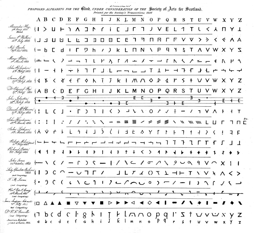
“Proposed Alphabets for the Blind, under consideration of the Society of Arts for Scotland.” (Printed for the Society’s Transactions, 1836.), this being a “Plate... appended to the 42d Number of this Journal for October 1836.” The Edinburgh New Philosophical Journal (1836)
Nineteen contributors named at left of their respective alphabets :
Alexander Hay, 9th Jany 1832. Blind.
James P. Walker, 15th July 1832.
Miss Banks, 29th Novr 1832.
Mungo Ponton, 1st March 1833.
John Richardson, 6th Febry 1833.
James Gall, 27th Febry 1833.
Dr. Edmund Fry, 27th Febry 1833.
Daniel McPherson, 27th Febry 1833.
John Henderson, 12th March 1833.
John Lothian, 1st March 1833.
Robert Milne, 25th Febry 1833. Blind.
Richard Eaton, 23rd Febry 1833.
John Jones, 24th October 1833
Lady Charlotte Erskine, 1832. (not competing.)
F. M. Lucas, (not competing)
Revd Edwd Craig, 12th March 1833 (not competing.)
James Simpson – Advocate, 25th Febry 1835. not competing
Dr. R. K. Greville (not Competing.)
American Alphabet printed at Boston., 1835.
Report by the Committee appointed by the Society for the Encouragement of the Useful Arts in Scotland, to take into consideration the various communications to the Society regarding the best alphabet and method of printing for the use of the blind.
BL copy at Google Books
The two alphabets proposed by blind individuals (Alexander Hay, and Robert Milne) are among the more abstract. Milne’s in particular is minimalist, with letters A-P oriented around a horizontal bar, and Q-Z around a vertical bar. These and a few others (Richardson, Ponton) show some similarity to optical telegraph systems (e.g., Chappe); others are reminiscent of stenographic systems. Some (McPherson, Lothian) appear to combine telegraphic and stenographic symbols.
Milne is unlike Braille, yet shares its minimal form, and complete departure from Roman or even stenographic alphabet. Robert Milne had with David Macbeath developed a string alphabet for the use of the blind
(Macbeath and Milne, 1822).
Fry’s (1833) is a sans serif font. (Wm Caslon’s foundry had issued a sans serif in 1816.) The idea may have been that serifs bore no information — for tactile readers — and so could be dispensed.
Milne’s alphabet follows another logic: retain a spine, from which serif-like appendages bear the clues for differentiating one symbol from another. The permutations unwind along the horizontal bar until, exhausted, they pick up on a vertical — so much for the efficiency of a monospaced letter, such as Braille offers. The logic also takes no account of letter-frequency in English. The Hay (blind) and Walker alphabets are close to monospaced. Hay uses a variety of differentiating elements that are more heterogenous than is absolutely necessary. Walker employs a common cryptographic device called a pig pen cipher, and exhausting his vertical and horizontal variations A-R, turns to diagonal spines for S-Z.
Craig’s alphabet (fourth from bottom) is interesting not so much for its centerline, than its minimal components : will count when leisure allows, but there may even be opportunities for further compression, e.g., the bowls for letters K-N might be assembled from the components for J, which themselves suggest possibilities for letters D and G.
Pamela Lorimer writes: “Some of the authors of arbitrary codes for the competition... seemed carried away by the enjoyment of making a series of patterns with little idea of the perceptual and cognitive problems involved. The arbiter was the Reverend William Taylor of the York School, who being sighted, it is not surprising that he chose the entry of Dr Fry of Bristol, who had used the simplest form possible of capital letters using no serifs. A reader with sight always finds it difficult to assess the qualities of a code intended to be read by touch, and even a blind person needs practice before an unbiassed opinion should be given. Comments on all codes therefore need to be made with caution. The organisers of the competition had hoped that one best type would result from their project. In fact, it had the opposite effect for the number of codes multiplied. They little realised that unity within Britain would not be achieved until nearly 40 years later.”
See chapter 3 of Pamela Lorimer, A Criticial Evaluation of the Historical Development of the Tactile Modes of Reading and an Analysis and Evaluation of Researches Carried Out in Endeavours to Make the Braille Code Easier to Read and to Write. A thesis submitted to the Faculty of Education and Continuing Studies of The University of Birmingham for the degree of Doctor of Philosophy, School of Education. December 1996
here [ accessed 11 January 07 ]
And see String Alphabet for the Use of the Blind, David Macbeath and Robert Milne, in The Edinburgh Philosophical Journal 6 (1822): 194-196.
This alphabet — and others shown above, including those of Gall, Hay, Fry and Craig — is also described in the entry for
Blind, Instruction of the in The Penny Cyclopaedia of the Society for the Diffusion of Useful Knowledge. Volume IV. Bassantin—Bloemaart. London: Charles Knight, 1835: 515-528 . (description at p517)